Increase charitable giving through a mobile shopping app
My team and I were charged with researching, testing, and validating an idea for a brand-new mobile application to solve a broad topic of social change. An ambitious, open-ended design prompt on a short timeline challenged us to manage a big vision with a realistic turnaround.
My Role & Contributions
I served as UX Researcher and UX/UI Designer.
I developed proto personas, conducted user interviews and desk research, co-wrote the user survey, collaborated on research synthesis, developed persona, created lo-fi and mid-fi wireframes, conducted competitive analysis, conducted user testing, and collaborated on the design of a high-fidelity clickable prototype.
Team
Thea Pajunen, Arvin Figues, Andrew Dawson, and Nick Pugliese. All work was done remotely.
Tools
Gsuite, Figma, Miro, Zoom, Invision, Whimsical, FlowMapp, Adobe CC
Scope & Constraints
This project was completed over a span of two weeks in September and October 2020. The short timeframe and lack of budget required our team to be nimble and resourceful.
Developing something new in the social change sphere is difficult, as one or more organizations already exist to promote or help practically every cause or issue out there. Rather than identify a singular social cause to address, our team focused on how to further amplify the efforts of existing non-profits and charities. This approach stemmed from our group’s diverse range of charitable interests and the abundance of organizations already serving those causes. As charitable donors ourselves, we wanted to find a way to not only increase our overall monetary contributions but to do so more routinely.
Users & Audience
The following assumptions helped us develop a proto-persona from which we could launch our research:
Assumption #1
People are more likely to donate to nonprofits they already know and trust.
Assumption #2
Economic instability may prevent people from donating as generously or frequently as they have in the past.
Assumption #3
It is easier to donate to a cause when it is bundled into common behaviors and routines, such as rounding up the total at the grocery store or buying a product that has donations built into the business mode.
Assumption #4
People donate to specific organizations because of a personal connection to the cause or it directly impacts their community.
Breaking Down the Process
Using our assumptions and proto-persona as a starting point, we formed a research plan that included conducting user research, industry analysis, competitive analysis, user interviews, and secondary research.
We started our research by conducting an online survey to understand what influenced people’s behaviors around charitable donations and how technology is leveraged in making donations. We also needed to challenge the assumptions we had about our end user.
The largest group of respondents fell into the 30 to 39-year-old age range and was a working professional with an average annual income of $75k. Sixty percent of respondents had used technology to donate to an organization and the vast majority preferred to make multiple donations in smaller amounts rather than in one large donation.
These insights led us into our competitive research, where we identified four digital tools/products that we perceived as potential solutions to our problem: Give Tide, Roundup, Amazon Smile, and Honey. After analyzing their strengths, weaknesses, opportunities, and threats, we found that each offering had features that could appeal to our needs, but none provided a comprehensive solution.
Our team conducted interviews to better understand the following objectives:
Objective #1
Discover user motivations and hurdles towards donating to charity.
Objective #2
Discern users’ willingness to engage in small continuous transactions.
Objective #3
Understand how technology is leveraged in making donations.
A few common themes arose during our interviews:
All participants used at least one kind of digital reminder tool, though many also relied on analog tools.
Hearing from a friend out of the blue elicited feelings of joy and surprise. The same goes for receiving unexpected gifts.
Multiple people used incremental savings apps (e.g. Roundup) and would like a similar turnkey solution for making micro-donations.
“I just think it’s important to find something that means something to you. It’s really nice to know that you’re doing something that’s impactful.”
“I’d rather do smaller amounts, but when I’m able to be in a position where I’m making more money than I am now, then I would probably be inclined to do a bigger sum.”
“We’ve been trying to find companies or people that do a ‘buy one, give one’ thing where they’re donating or they increase the cost of your mask so that they can then donate an equal number to your purchase.”
We conducted secondary research to get a broader understanding of people’s positions and behavior toward donating to charities and nonprofits.
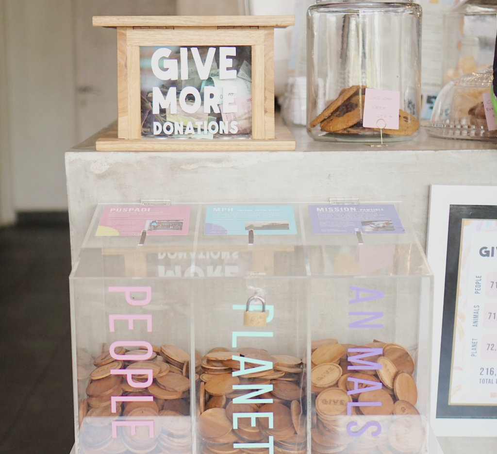
55% of American households say they give to charity.
People are more likely to give to nonprofits that they trust will use their donated money to make a difference.
The main reason why people are hesitant to give to charities is they feel like they can’t afford it.
Defining the Problem
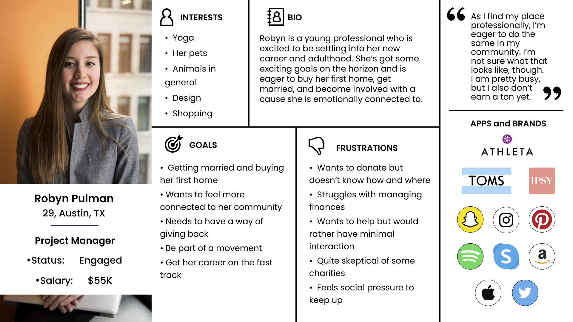
We gathered all of our interview observations into a Miro board and started affinity mapping. From there, we developed an empathy map which led to the development of our refined user persona, Tracy.
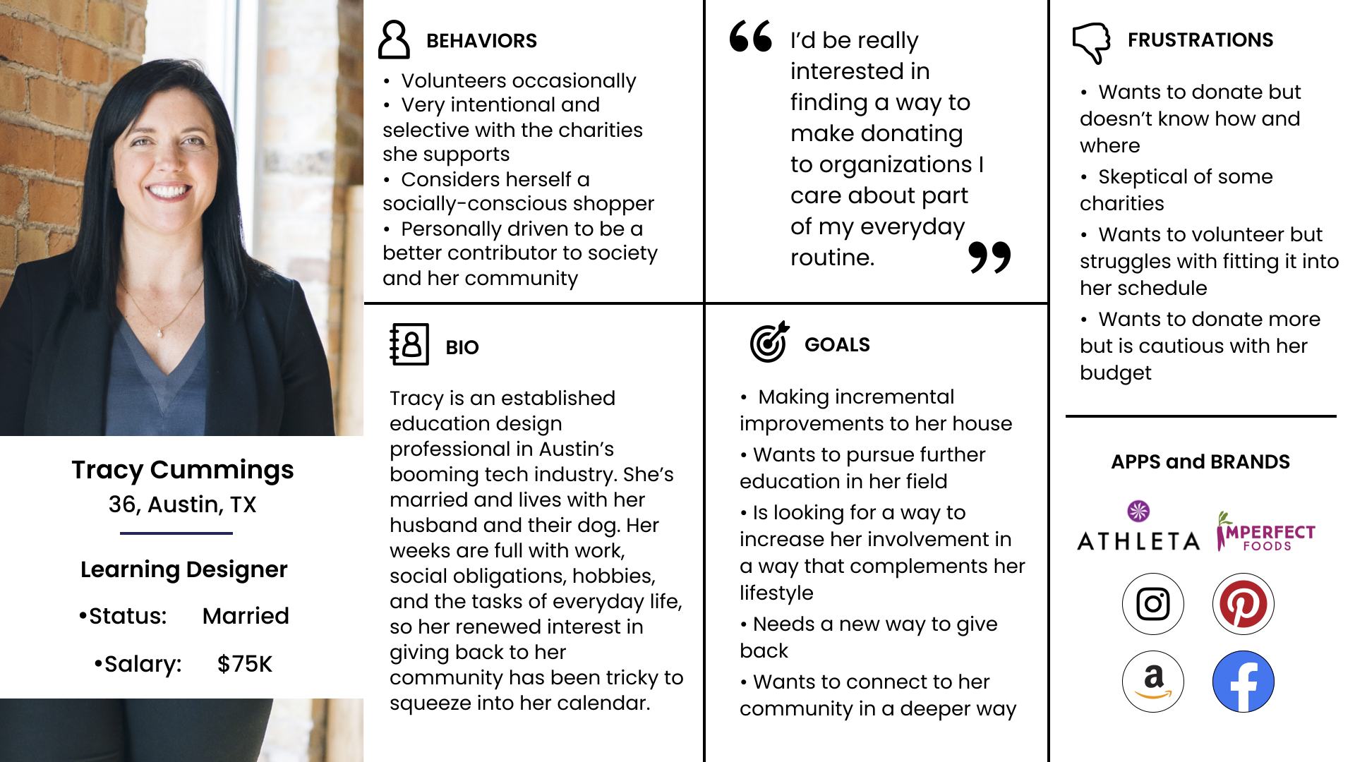
Our initial assumption was that our end-user is an unmarried millennial who is getting her footing in her career, adulthood, and is saving up to buy her first home. We saw this person as a routine volunteer for local organizations and maybe even an employee at a non-profit, however, our primary research showed us that this person would prefer to donate to an organization rather than volunteer. We also assumed she wouldn’t be making much money at her non-profit job, which didn’t match our research findings either. By updating our persona to match our research, she has a higher income and is able to do some discretionary shopping.
Despite having such a full life, Tracy wants to do more, especially right now as she sees the need for volunteers and charitable donations. She doesn’t have the time to volunteer, but she’s also not sure she has enough extra money to make a worthwhile donation anywhere. She’s also a little wary of some online fundraisers and is honestly pretty overwhelmed by how many different organizations are asking for money right now. She’d give if she knew where to do it, and if she was sure she could afford it.
Once we formed an understanding of our end user, we were ready to develop a problem statement. We needed to clearly define what Tracy faces when it comes to feeling like a more involved or charitable person. After multiple iterations – and really digging into her core needs – we landed on the following:
User Insight
During our research, we found that Millennials have a desire to give back more but find it hard to do it in a less intrusive way. During our surveys and interviews, we discovered that there isn’t currently an effective way to connect people’s spending habits with a way to give back on a regular basis.
Problem Statement
Young professionals are looking for ways to give back to non-profit organizations that they are interested in. Consistently giving a reasonable amount to trustworthy organizations should be an easier, enjoyable experience. Through our research, we discovered that time constraints and financial insecurities prevent people from supporting all the organizations they are passionate about. Supporting these organizations and feeling connected to your community shouldn’t feel burdensome.
How might we provide a solution that offers the ability to contribute small regular donations to trusted organizations of their choice through online purchases?
Ideation
Using the I Like, I Wish, What If method, we focused on prioritizing and voting on the options that best represented Tracy’s desires and needs. We know she likes online shopping, supporting brands that give back, and supporting causes that are near and dear to her heart. She wishes she could donate more money in general, that she had more money to give, that she could feel good about all of her purchases (i.e. buying from a company that is committed to a social cause, etc.), that she knew which organizations were worthwhile or trustworthy to donate to, and that she could keep track of what she donates.
She wonders: What if I could inspire my friends to do more in their community? What if there were more ways for me to impact my community? What if my online shopping could earn me money to donate to non-profits? What if I didn’t have to work donating into my yearly budget?
Using a feature prioritization matrix helped us identify the top priority for Tracy: Turning her online shopping habit into a way to donate. The next two priorities address her desire to inspire her friends to do more for their community and wanting to feel sufficiently educated about an organization before donating. While we could see some of the other high impact, high priority items fitting into the design, they would only be considered if they could fit within the main flow.
Features that would have to be persued in future versions of the product:
- Highlighting brands that give back on their own
- Direct donating to organizations
- A trust score for organizations
- A way to include cash-backs on top of the earned donations to build value for the user as well as the organizations
Despite not including these features in our initial version of the app, our team worked through how they could be worked in with future releases and identified partnerships to help facilitate the implementation of those features.
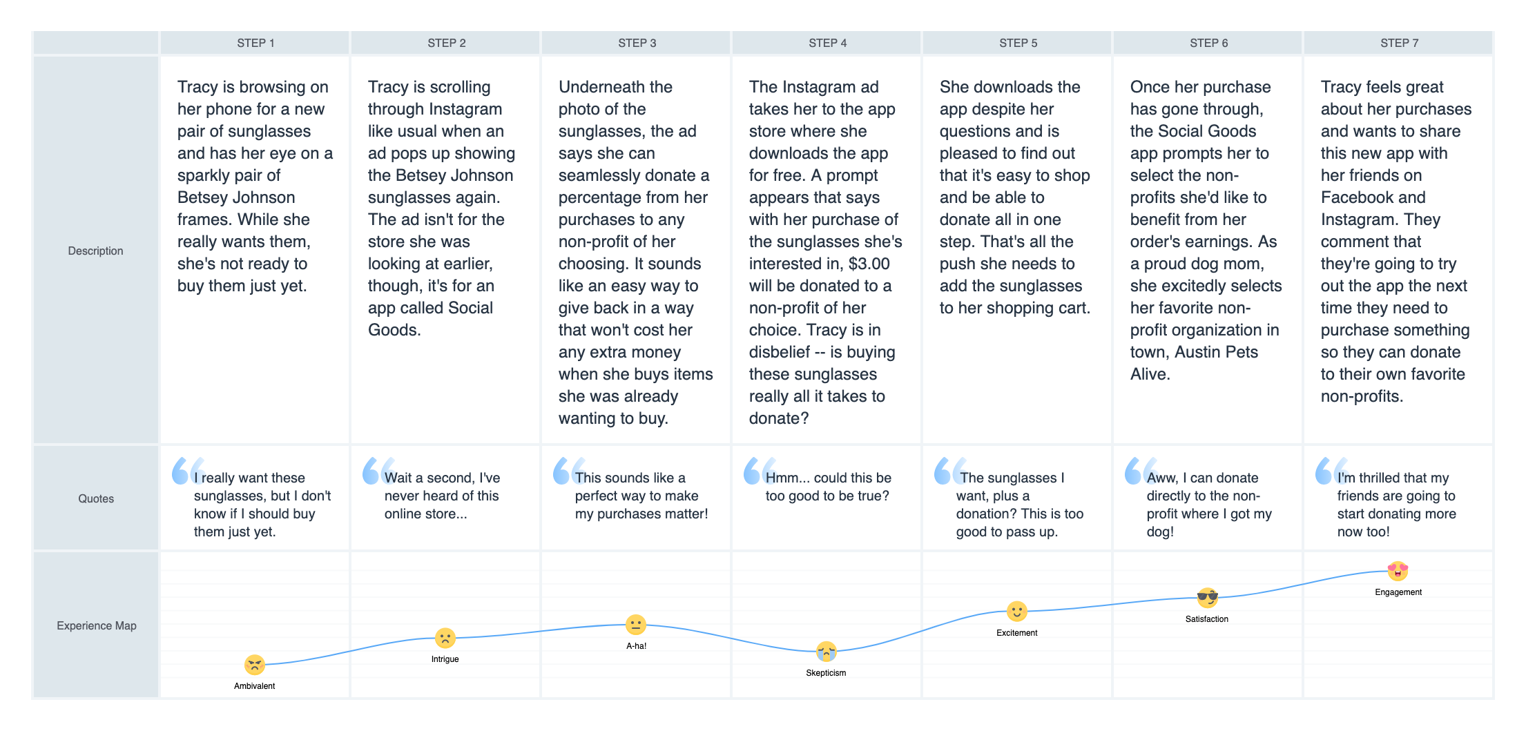
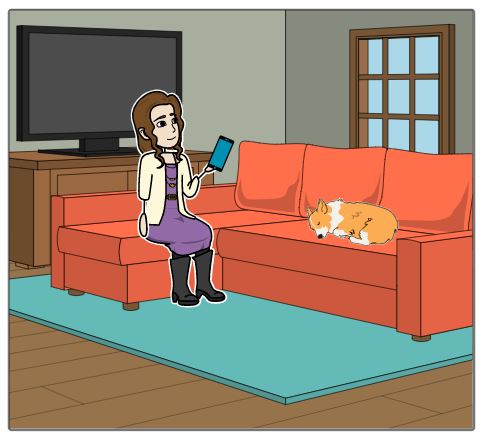
Our storyboard used the user flow as its foundation. That led to the development of a journey map that builds out our persona’s story from start to (presumable) finish, with their refined user scenario, goals, and opportunities included.
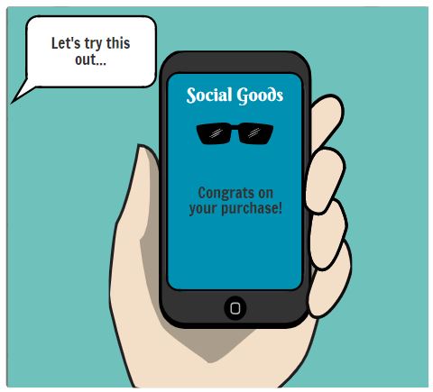
One day as Tracy idly “window shops” on her phone, she finds herself falling in love with a pair of sunglasses. Even though she’d like to buy the sunglasses right then, she exercises restraint and keeps browsing without purchasing them.
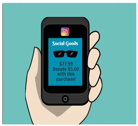
Later that day, Tracy is scrolling through Instagram when she sees a retargeted ad for those same sunglasses. However, they’re being sold by a different retailer through an app she hasn’t heard of called Social Goods.
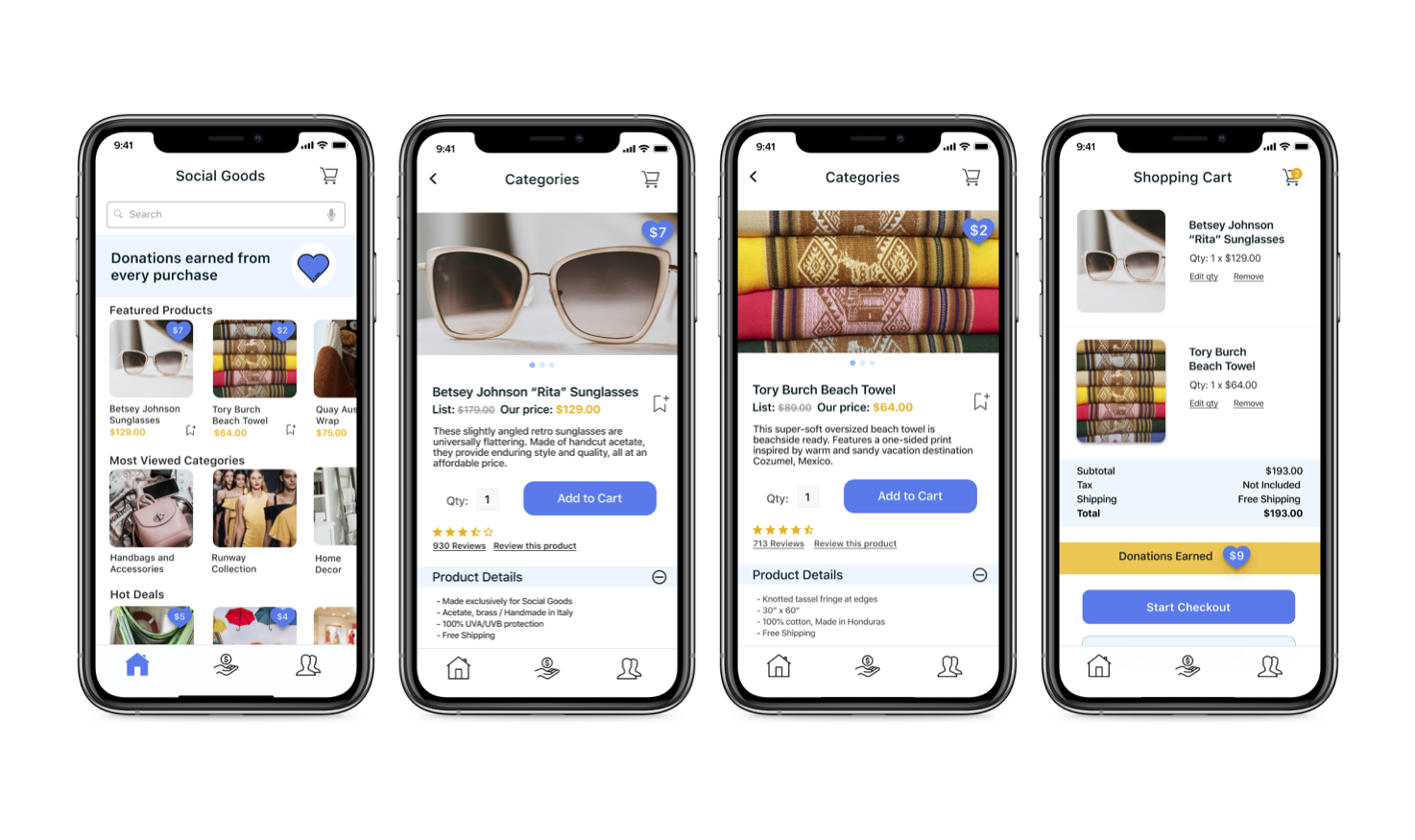
Despite her skepticism, she downloads the app. To her surprise and delight, the sunglasses are less expensive through Social Goods, and she can immediately earn money back to donate to a non-profit of her choosing.
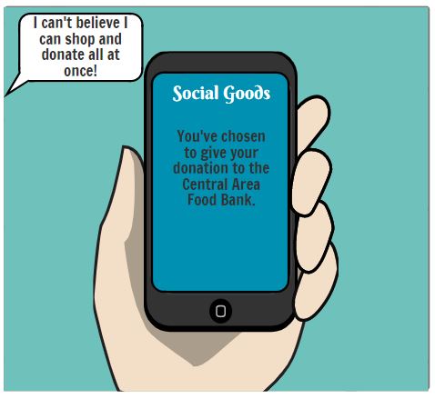
That was the nudge Tracy needed to buy the coveted sunglasses. After buying the sunglasses, she selects the Central Area Food Bank as the recipient of the donation she earned through the app.
Design & Wireframing
Our initial user flow was a straightforward flow to give us a foundation for building paper prototypes. We tested our flows amongst ourselves and identified any issues to address during iterations.
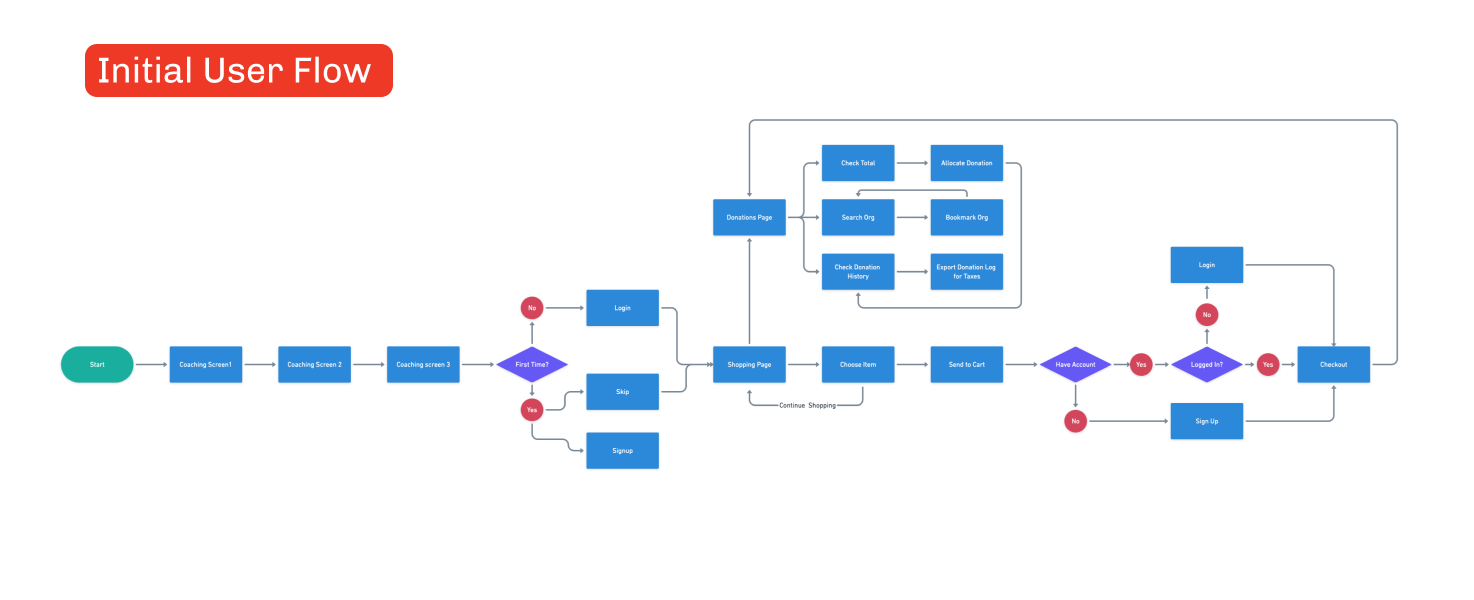
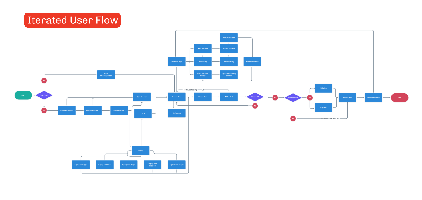
For the iterated user flow, we created a full map to search for any dead-ends or redundancies. We further refined the donation path and looked for opportunities to streamline the flow to reduce bounce by getting shoppers to checkout quicker.
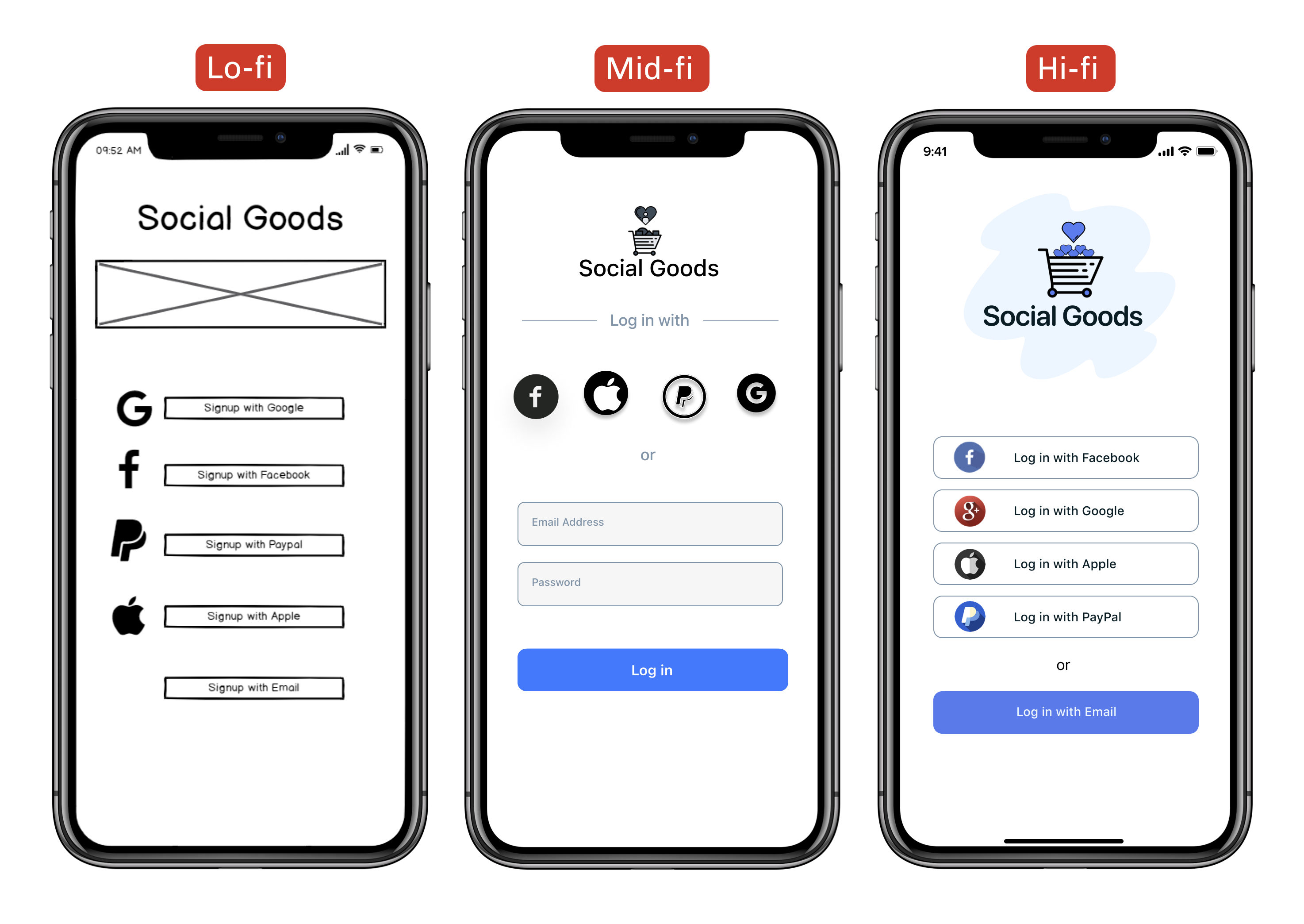
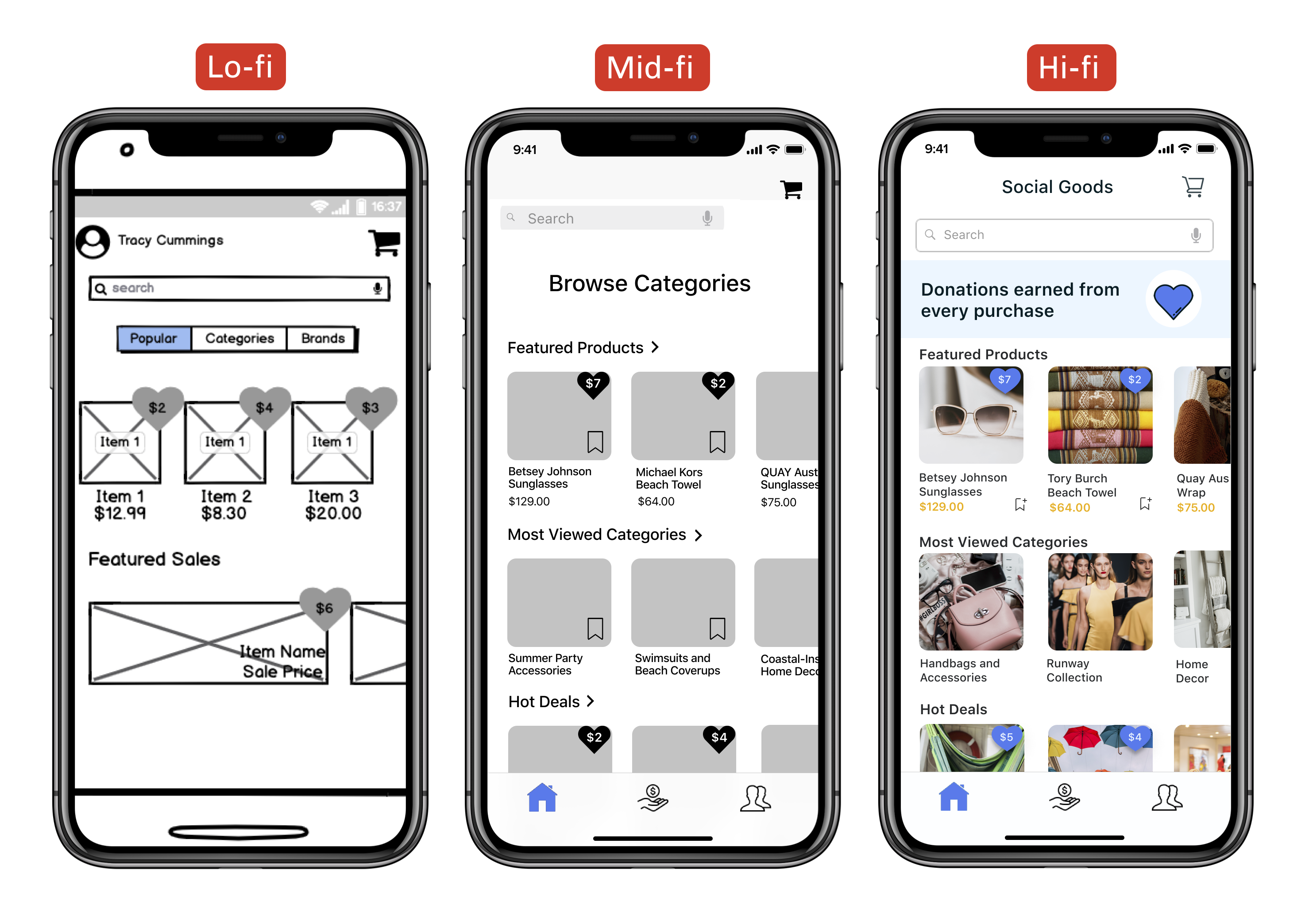
As we began to visualize how our app would look, we each designed a low-fidelity wireframe prototype. Combining our favorite aspects from all of our designs, we built a clickable mid-fidelity prototype and tested it with six individuals. We digested and prioritized their feedback and implemented the changes.
As we began to visualize how our app would look, we each designed a low-fidelity wireframe prototype. Combining our favorite aspects from all of our designs, we built a clickable mid-fidelity prototype and tested it with six individuals. We digested and prioritized their feedback and implemented the changes.
We made sure to include social login options so that Tracy could have her payment information ready to roll, ensuring a smooth checkout process.
Shopping screens use hearts to indicate the donation amount earned.
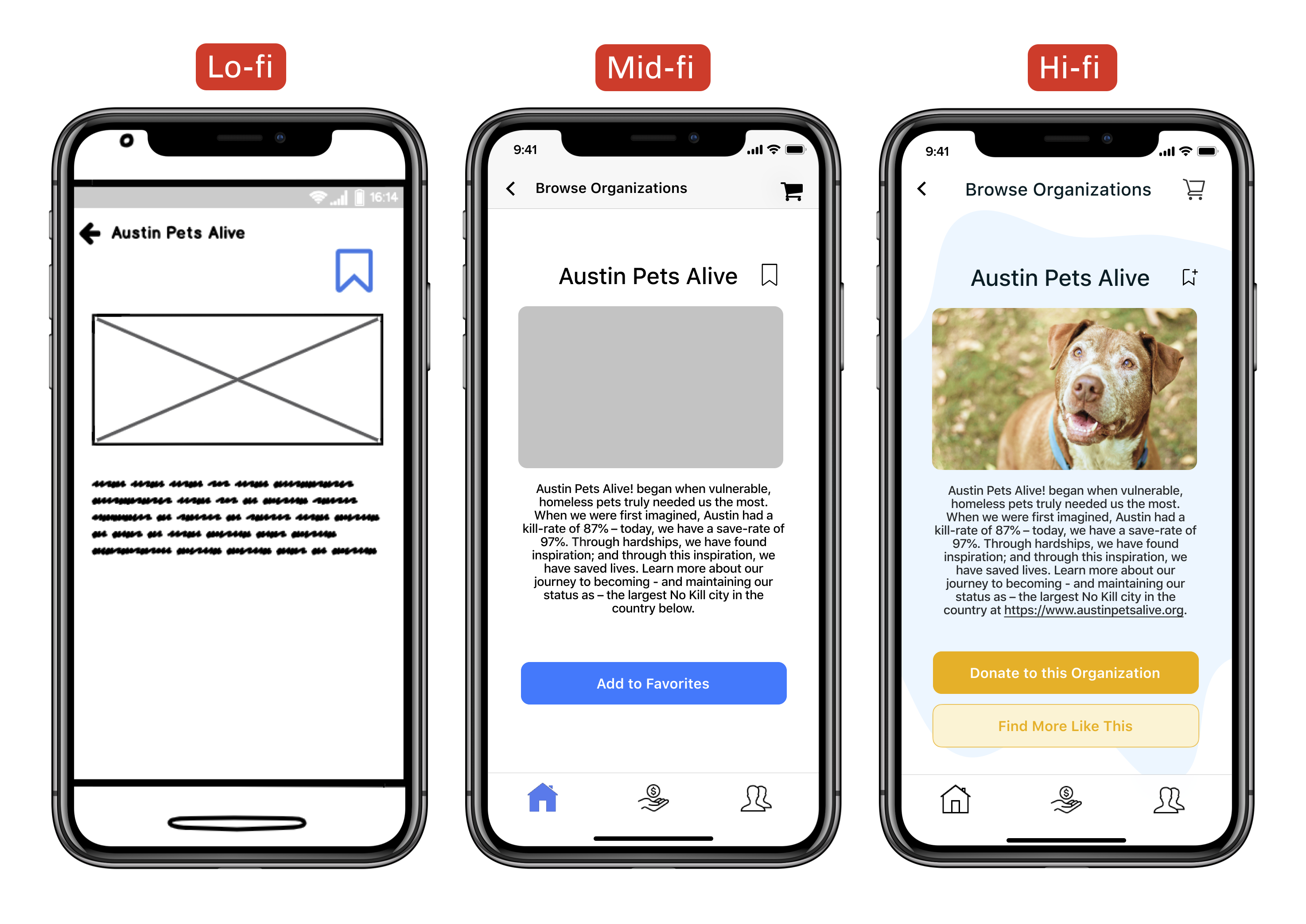
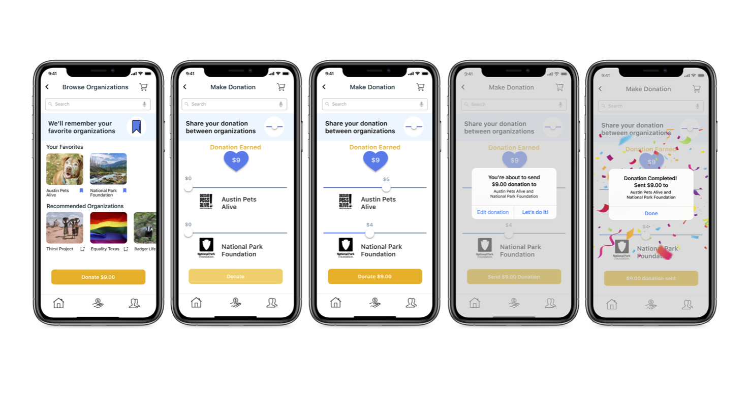
The ability to search and bookmark her favorite organizations:
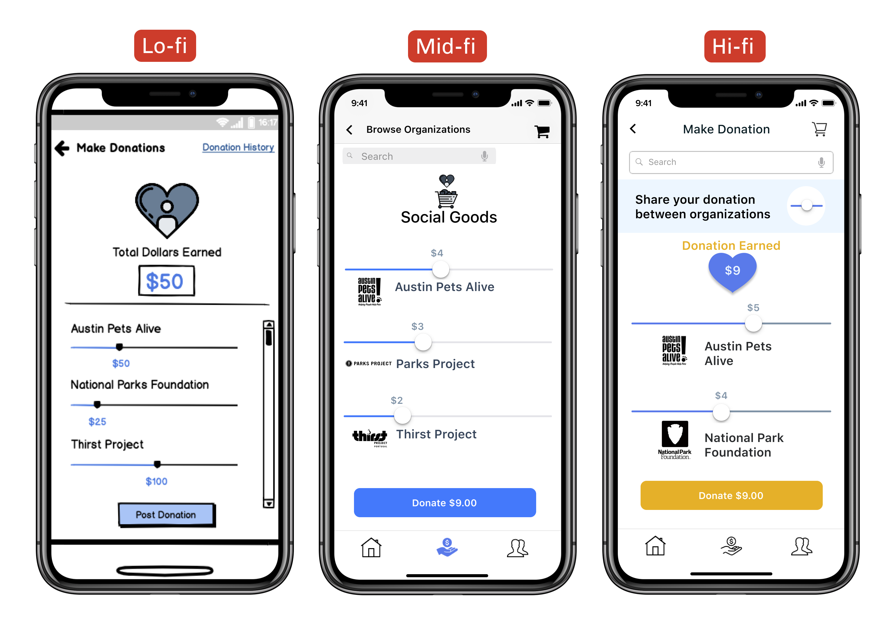
Utilizing sliders on the donation page so that Tracy could quickly and easily adjust the earned amount to split it between her favorite organizations:
For the high fidelity prototype, we aimed to imbue three main emotions: trust, fun, and optimism. To do this, we used illustrations that used a flat and hand-drawn aesthetic for our onboarding screens. This helped illustrate our use case values as well as set the tone of our app from the start. Since our research showed trust was a big factor when it came to making a donation, we wanted to choose a color that evoked that feeling. We selected a balanced shade of blue as our primary color due to its connection to feelings of trust and loyalty. For our secondary color, we chose a complementary goldenrod yellow which evokes optimism and injects vibrancy into the color scheme.

High Fidelity Prototypes
We added user control to the donation process by utilizing sliders to help distribute donation funds easily and precisely. Once the donation is made, the user is met with confetti to celebrate their good deed.
Final thoughts
We reflected on our work and gathered the following insights to consider during future projects:
- Start — and keep — a furious pace to allow yourself extra time; you’ll be grateful later when you have a moment to breathe.
- Involve every member of the team on as much as you can; use collaborative software to make this possible. In the end, you want to see everyone’s fingerprints on all aspects of your team’s project.
- But also know when to divide and conquer. When it comes down to the wire, do your best to identify your teammates’ strengths and assign tasks accordingly.
If this product were to actually launch, we would want to consider the following for our next steps:
- Social Share – The ability to post to social channels with your donation details. This is a chance for donors to be proud of what they’ve given and to inspire others.
- Direct Donations – If you want to donate more than just what you earn through your in-app purchases, you can donate directly through your credit card.
- Alternative Donation Options – If designated, organizations can request items or services in lieu of monetary donations. For example, an organization can request face masks and gloves from a vendor of their choice.
- Donation Impact Overview – After each donation, receive a summary of how your specific donation impacts an organization. For example, a $15 donation to Austin Pets Alive! provides three flea collars and two heartworm treatments.
- Shopping and Organization Recommendations – Using an algorithm, the app makes recommendations for items and non-profit organizations that are customized to each user.


Contact

