Healthcare Mobile App Prototype to
Prevent Social Isolation
For our final UX/UI design bootcamp project, my team and I were tasked with identifying a healthcare problem, developing a solution, and presenting a high-fidelity clickable prototype. This project gave us a chance to flex all of the skills we learned over the past five months and build something ambitious that was wholly our own.
My Role & Contributions
I served as Project Manager, UX Researcher, and UX/UI Designer.
I developed proto personas, conducted exploratory user interviews and desk research, wrote the user survey, collaborated on research synthesis, developed the persona, created lo-fi and mid-fi wireframes, conducted competitive analyses, conducted user testing, and collaborated on the design of a high-fidelity clickable prototype.
Team
Thea Pajunen, David Ciccocioppo, Andrew Dawson, and Nick Pugliese. All work was done remotely.
Tools
Gsuite, Figma, Miro, Whimsical, Zoom
Scope & Constraints
This project was completed over a span of three weeks in September and October 2020. We didn’t have a budget, so our efforts needed to be cost-effective and efficient to ensure we met all of our internal deadlines.
This project occurred in the fall of 2020 and by then, we had seen so many new challenges arise over the year due to COVID-19. Our team was driven by concerns over the psychologically damaging effects of prolonged isolation. We witnessed people in our own social circles turn inward as they faced a variety of challenging circumstances such as job loss, sickness or death of a loved one, and financial instability. We posited that the compounding of those circumstances with the isolation of quarantine restrictions was a potentially lethal combination that desperately needed a solution.

Users & Audience
To get started, we developed multiple assumptions to guide us into the research phase.
Assumption #1
There is an opportunity to positively interrupt someone’s sense of isolation and/or depression through routine correspondence.
Assumption #2
Most people are pretty good at identifying when their friends need some help or words of encouragement… and most people are pretty bad at following through with sending said help or words of encouragement.
Assumption #3
There is an innate desire in humans to support one another in a time of crisis, but the demands of everyday life invariably get in the way and interrupt or derail outreach efforts.
Assumption #4
People are worried they will say the “wrong thing” to their friend who is feeling isolated, depressed, or stressed. This could be a roadblock to sending a friend in need.
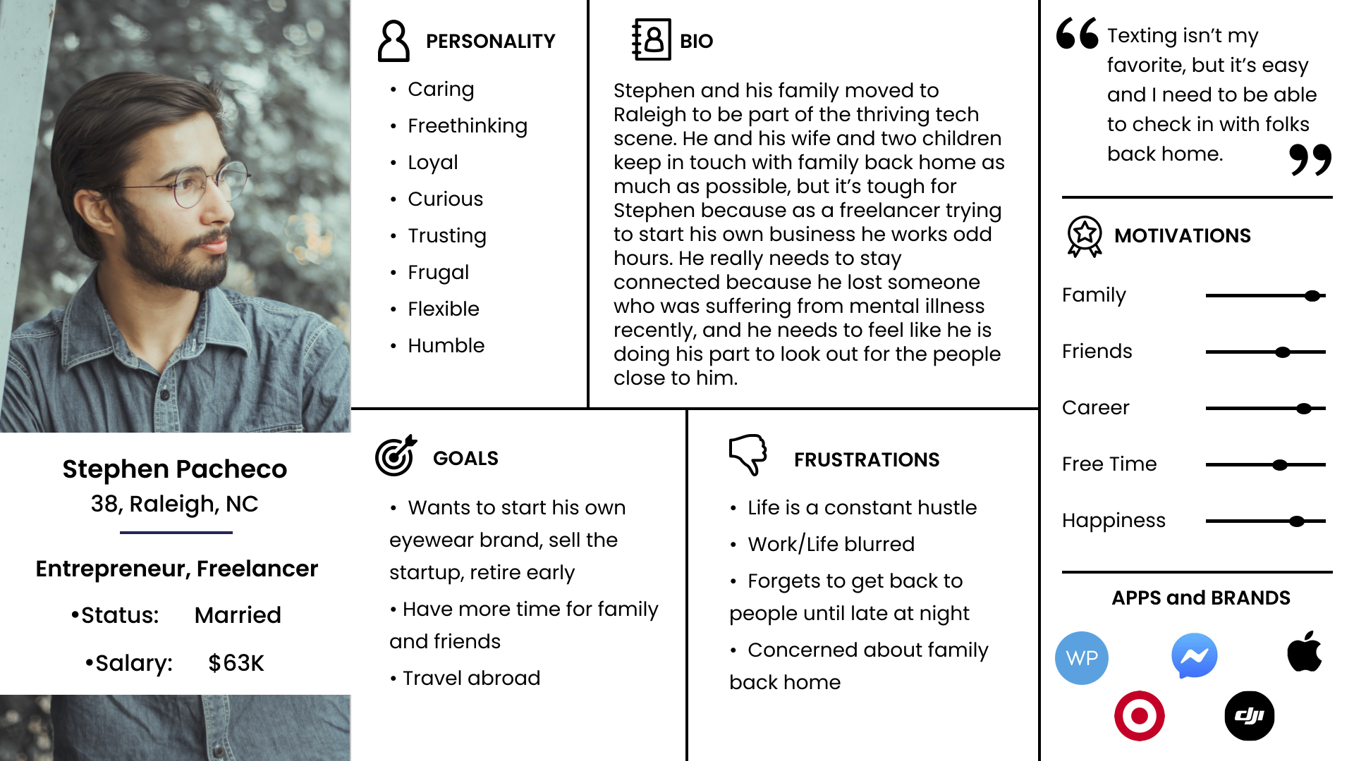
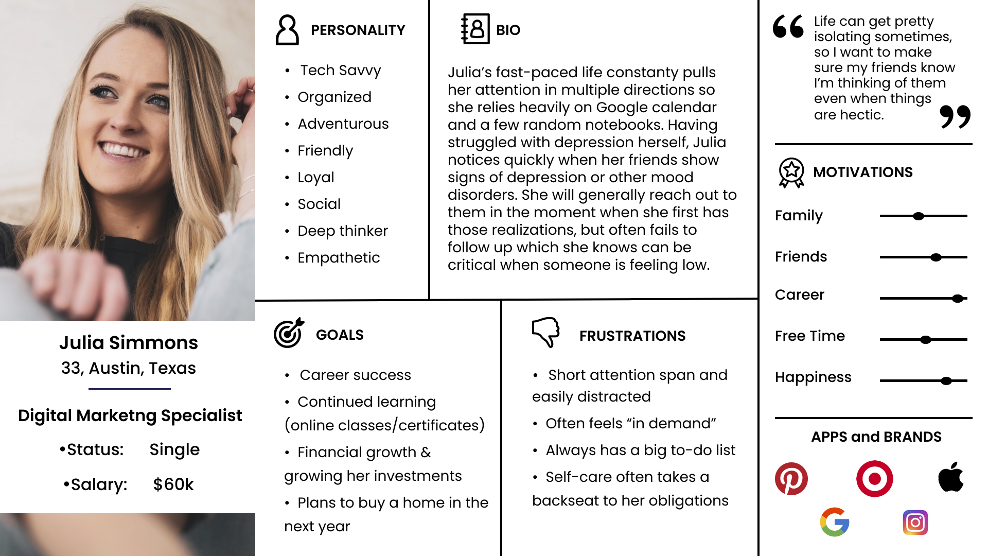
Building on our assumptions, we developed two proto-personas as a starting point to consider: who is our user? Both of these proto-personas were composed to represent the friend who wants to reach out to a friend they sense is struggling. Due to the restraints of this project, we did not create a proto-persona to represent the isolated individual.
Breaking Down the Process
Once we developed our assumptions and proto-personas, we developed a research plan that included conducting user research, user interviews, competitive analysis, and secondary research.
In order to gain insights around the way people communicate we conducted an online survey and found that only one quarter of our respondents felt that they communicated enough with people. Most people felt that they could be doing a better job of reaching out.
We also found that most of these people use digital tools, such as an agenda or calendar to keep track of events and appointments. From this data, we began to make the assumption that a digital tool could help users achieve their goals of reaching out more.
These insights provided a starting point for our competitive research. Using the SWOT format, we broke down the strengths, weaknesses, opportunities, and threats of four apps that could potentially address our user’s issues: Friendly Reminder, Make Talk, Google Calendar, and Apple Reminders.
We found that each of those addressed only certain facets of our user’s issues and none of them were developed to solve for the core problem of isolation and its effect on mental health.
We conducted interviews to gain clarity on three objectives:
Objective #1
Identify the ways in which people make everyday casual connections with people they care about.
Objective #2
Understand how these interactions make them and the person they are reaching out to feel.
Objective #3
Determine whether or not they could use help remembering to make these connections.
A few common themes arose during our interviews:
All participants used at least one kind of digital reminder tool, though many also relied on analog tools.
Hearing from a friend out of the blue elicited feelings of joy and surprise. The same goes for receiving unexpected gifts.
The majority of participants said they’ve “dropped the ball” with some friend communications.
“I’ve definitely been guilty of ghosting.”
“It’s hard to keep up with all your friends all the time.”
“Texting… it’s very, very easy to ignore and put off.”
We also turned to secondary research to better understand the link between isolation and mental health. Finding strong evidence between the two helped underpin our enthusiasm for finding solutions.
“People who feel more connected to others have lower rates of anxiety and depression. Moreover, studies show they also have higher self-esteem, are more empathic to others, more trusting and cooperative…”
“Research shows us that loneliness is on the rise, and that a lack of human connection can be more harmful to your health than obesity, smoking and high blood pressure.”

Defining the Problem
UX Hypothesis
We believe that helping busy people on the go make connections with the people that matter most will give them an emotional lift and alleviate feelings of isolation.
Problem Statement
We are designing an app to help busy millennials connect and strengthen relationships and increase happiness. Our research showed that building connections in your life improve overall health and alleviates symptoms of depression. How might we create an app that provides the tools necessary to facilitate relationships that provide an emotional lift for both parties?
Value Proposition
Our product is a mobile app that helps busy millennials reconnect with friends new and old. Keeping in touch with friends and family can be hard, even with a million ways to connect. We provide smart reminders, discussion prompts, and even conversation guides for the tough topics, empowering millennials to grow, strengthen and heal relationships in their life.
Ideation
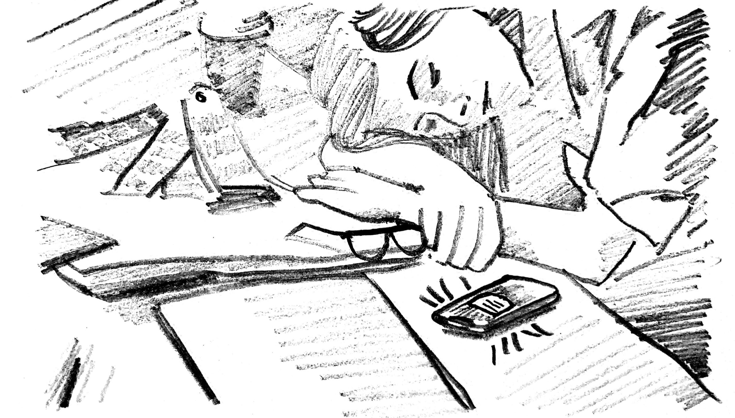
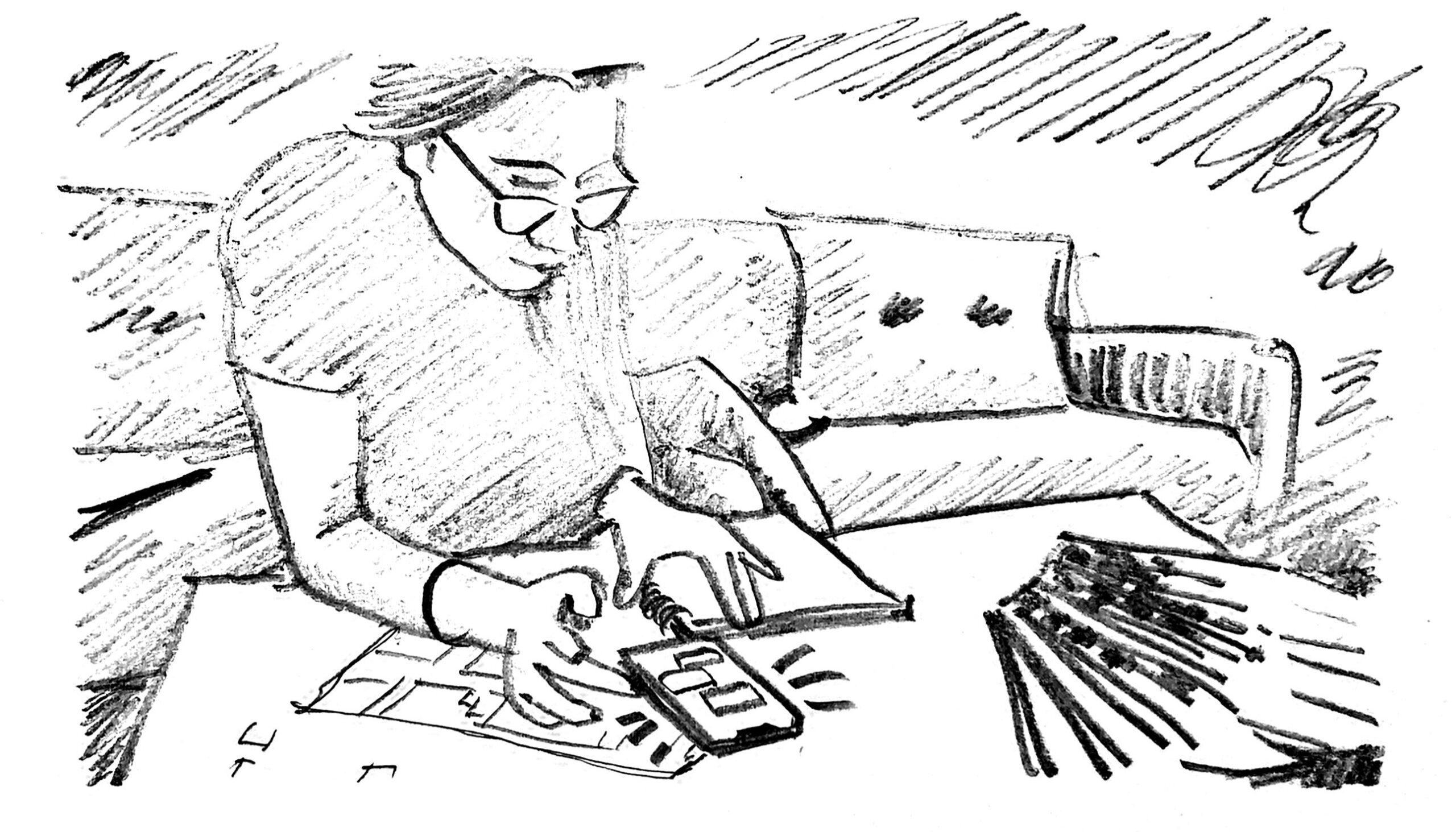
We then drafted an initial user flow, storyboard, and user journey map for our user persona to push us closer to our solution.
Our user persona informed our user experience scenario to help refine their goals, risks, and emotions. Because this person is a tech-savvy mobile phone user with a penchant for productivity digital apps, we chose to develop our solution as a mobile app.
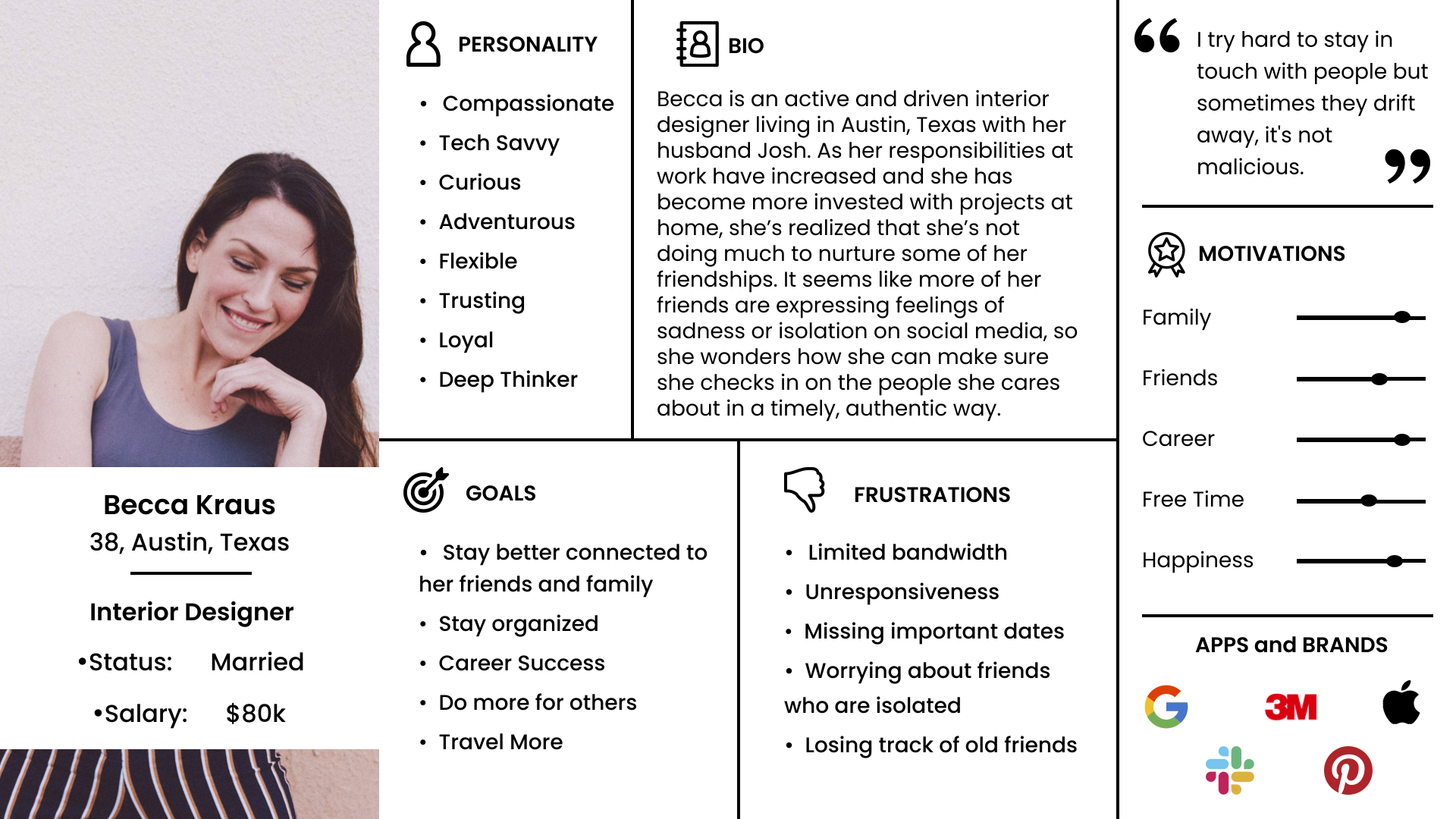
Our storyboard used the user flow as its foundation. That led to the development of a journey map that builds out our persona’s story from start to (presumable) finish, with their refined user scenario, goals, and opportunities included.
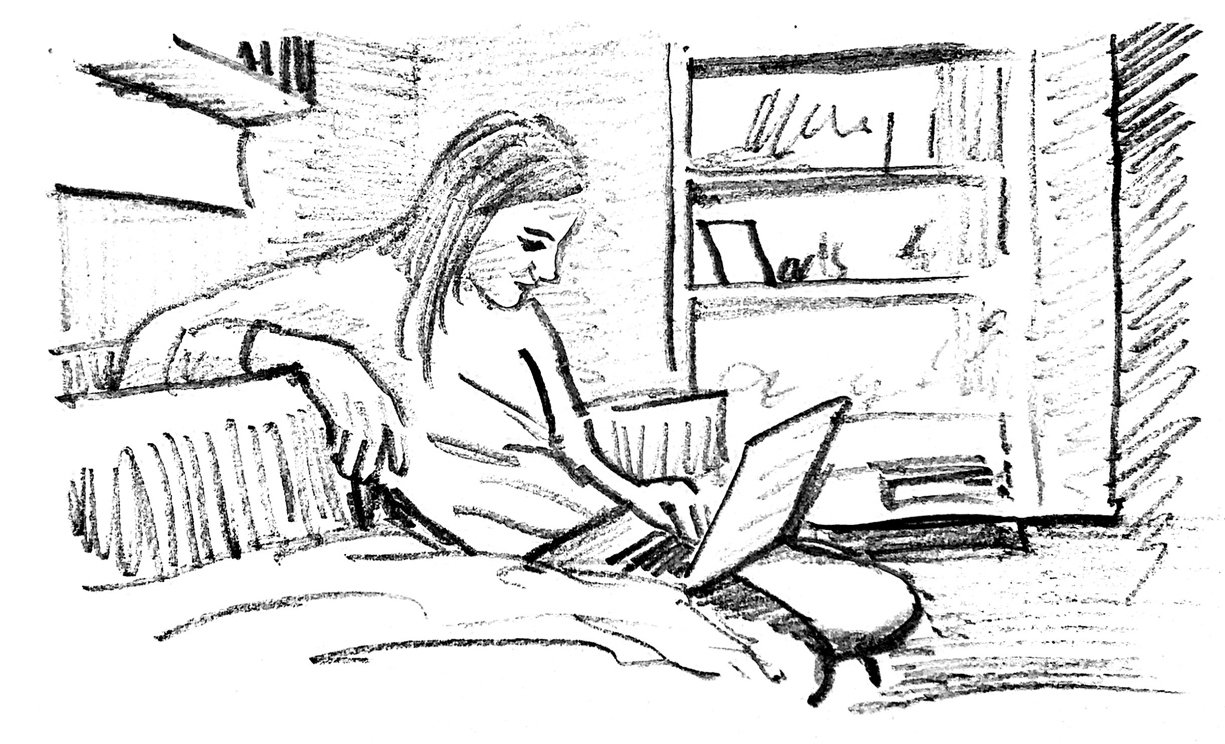
Becca is an interior designer who has a full plate at work and at home. Her busy lifestyle has made it difficult to stay in touch with people, even those that are closest to her.
In one instance, she forgot about a friend’s birthday. In another, she found out that a friend was hospitalized after experiencing a mental breakdown.
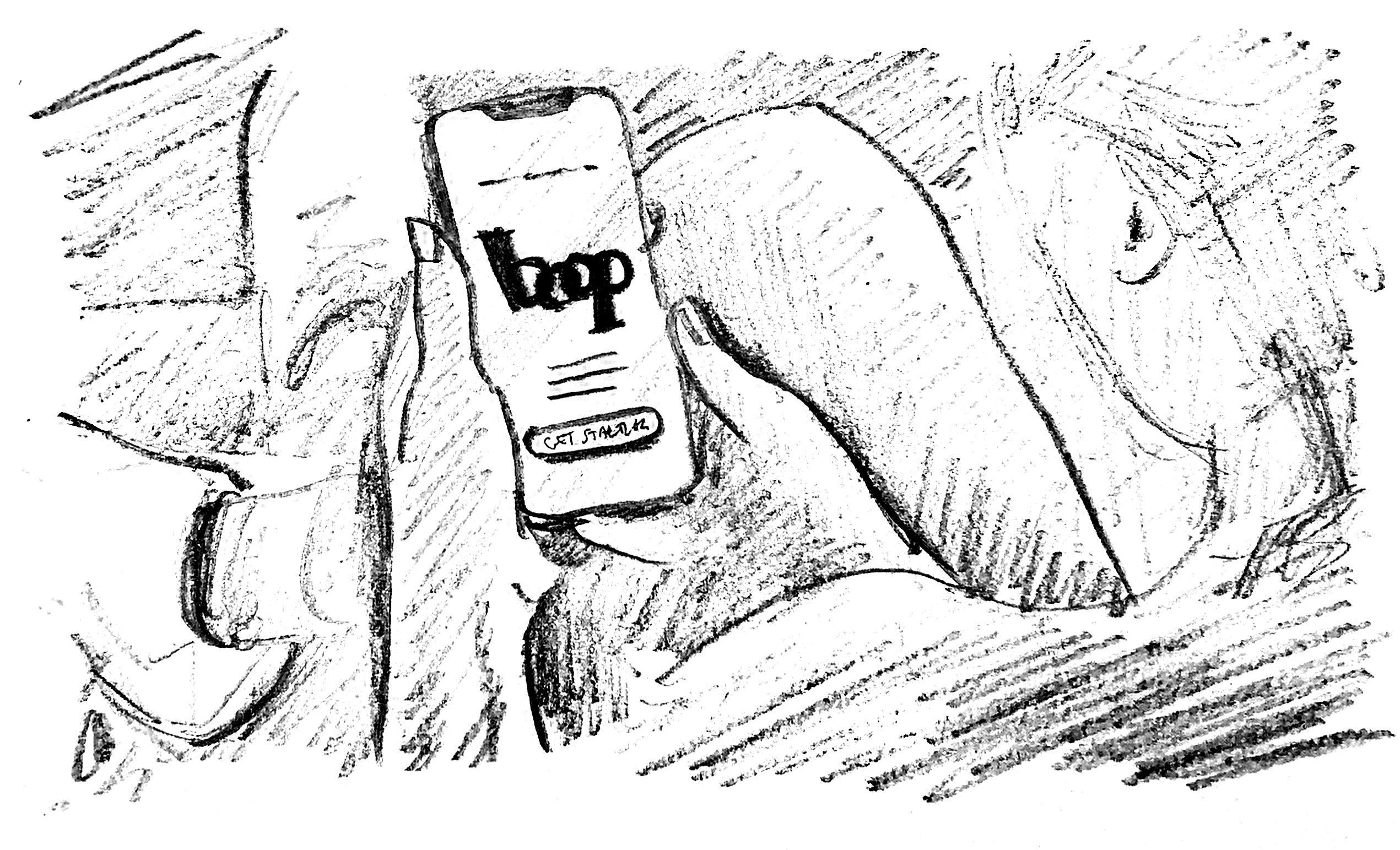
Becca turns to Google to look for ways to manage her time and relationships. She finds a blog article that features an app called Boop that helps users prioritize and strengthen their friendships.
Boop allows her to add her phone contacts and set reminders to prompt her to reach out to certain friends at random. She gives the app a shot and finds that it helps make sure her relationships stay a priority.
Becca’s situation led us to wonder if we could develop a solution that would remind our busy user base about the importance of making connections and to take action. Our observations and desk research suggested that authentic interactions do more than just make both parties feel good — they can also prevent or alleviate symptoms of depression and other mental health ailments. For example, data from experiments published in the journal Science suggest that social isolation is a major risk factor for mortality from widely varying causes. So the argument can be made that we can live longer by maintaining positive interactions with the people around us. Source
Design & Wireframing
We then drafted an initial user flow, storyboard, and user journey map for our user persona to push us closer to our solution.
Our user persona informed our user experience scenario to help refine their goals, risks, and emotions. Because this person is a tech-savvy mobile phone user with a penchant for productivity digital apps, we chose to develop our solution as a mobile app.
We took a divergent approach toward the wireframing of our user interface, by independently wireframing our own interpretations of how the navigation and key features should be presented. From here we aligned on the best solutions and an ideal flow to develop into a mid-fidelity prototype.
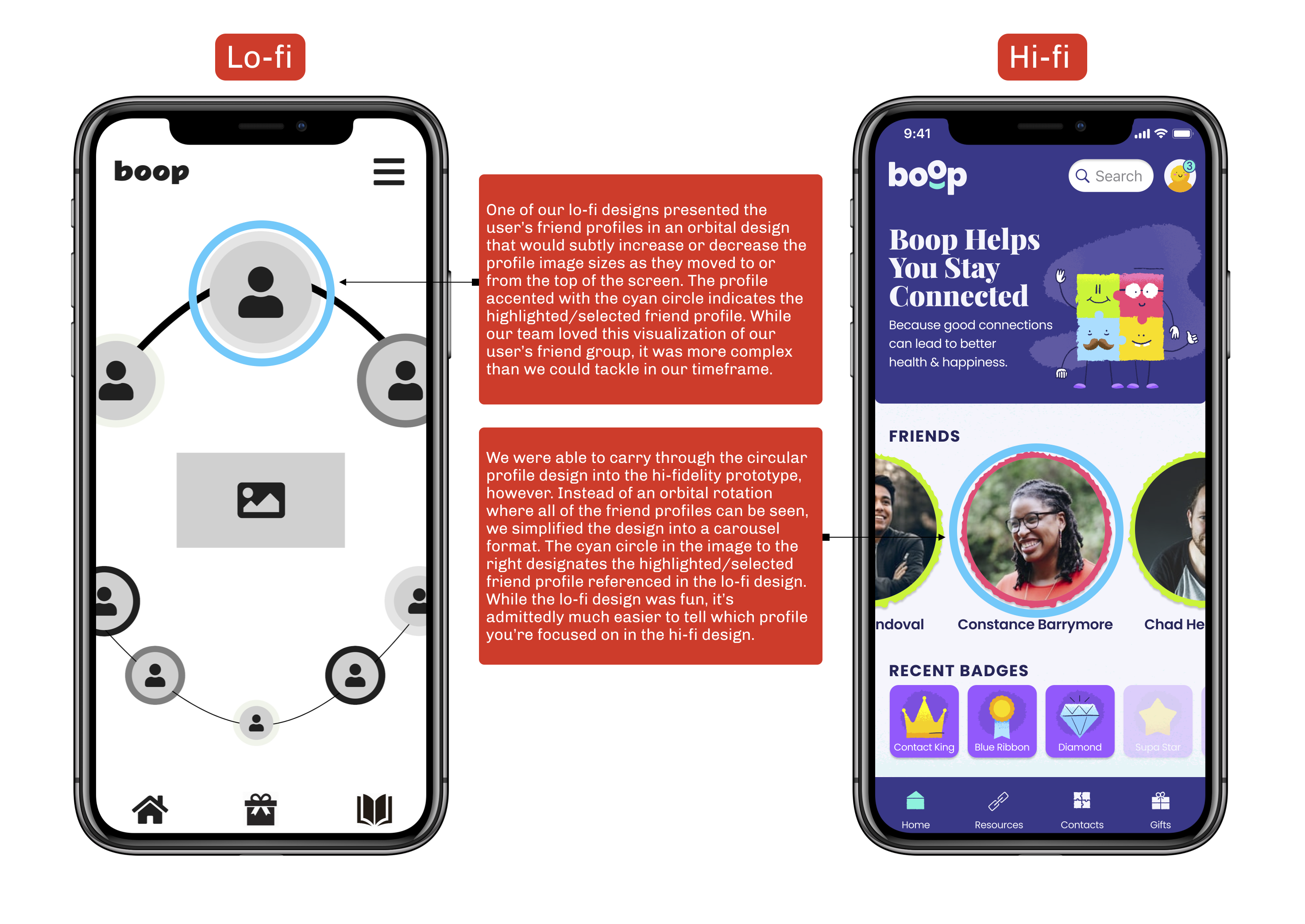
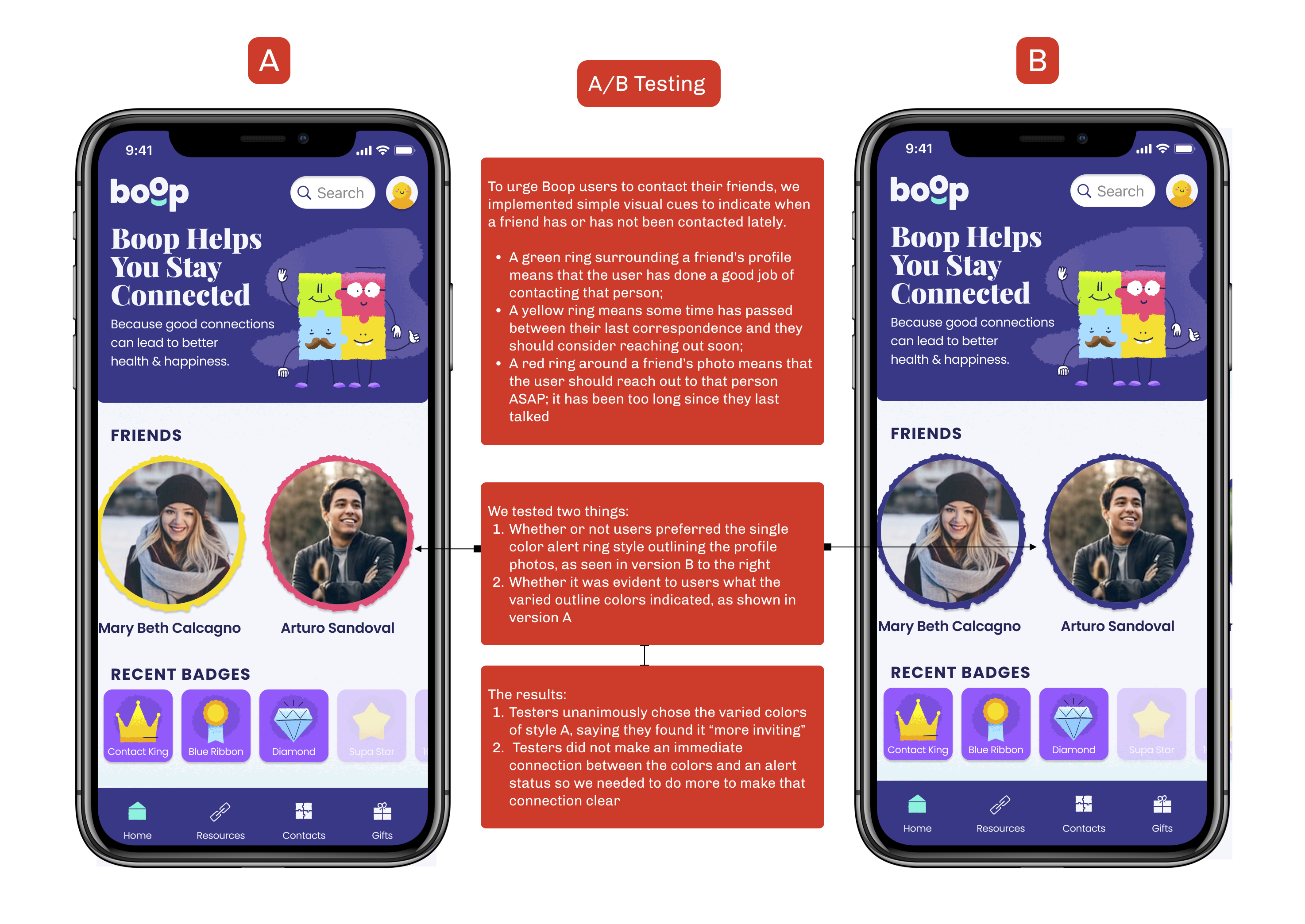
One of our executions from the initial wireframes that stood out featured a homepage solution with profiles that rotated in 3D space and incorporated different color borders to indicate the priority with which these people should be contacted. While we ultimately decided that this tech-heavy solution would be too difficult to prototype in time for testing, certain aspects of the design made it into our high fidelity prototypes.
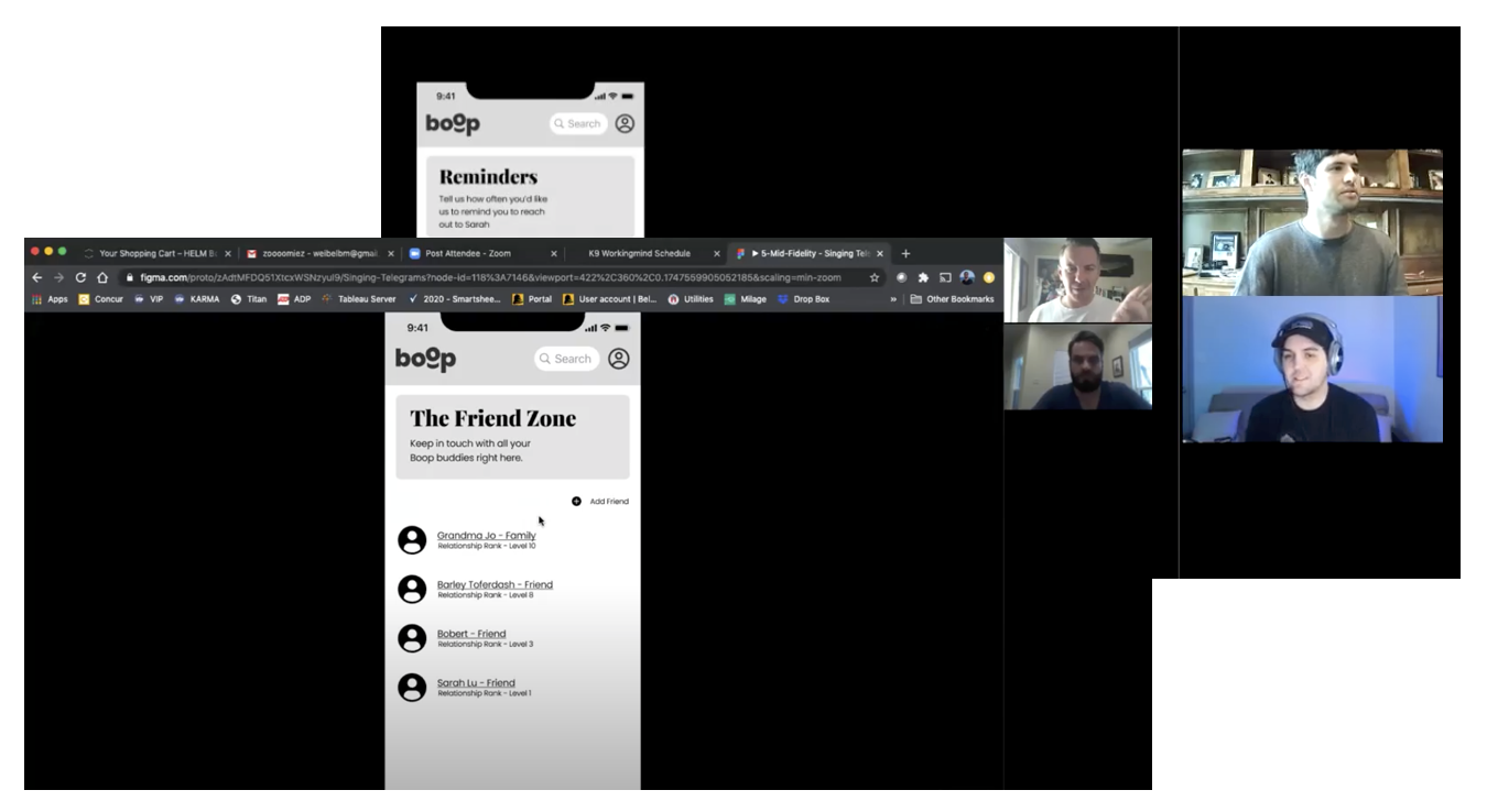
Key insights from mid-fidelity prototype user testing:
- Users wanted the ability to connect the app to their phones contact list so they could add friends easier
- Language on the menu and guide portions of the app needed to be clearer and more recognizable still
- This app could be very helpful even outside of our proposed user group possibly for customer relationship management and for people on the Autism Spectrum
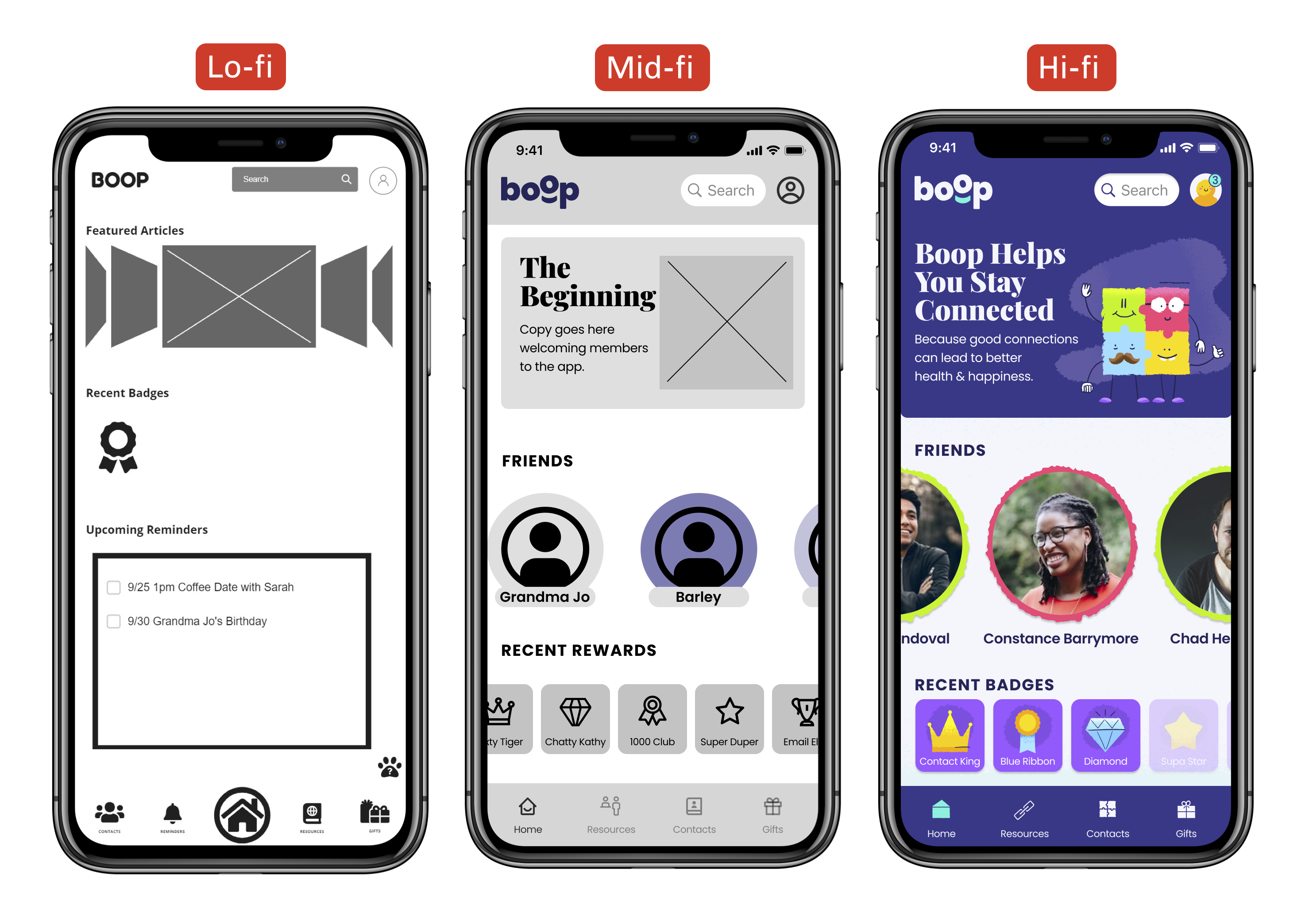
We focused on a simplified home screen that gives a quick view of important information.
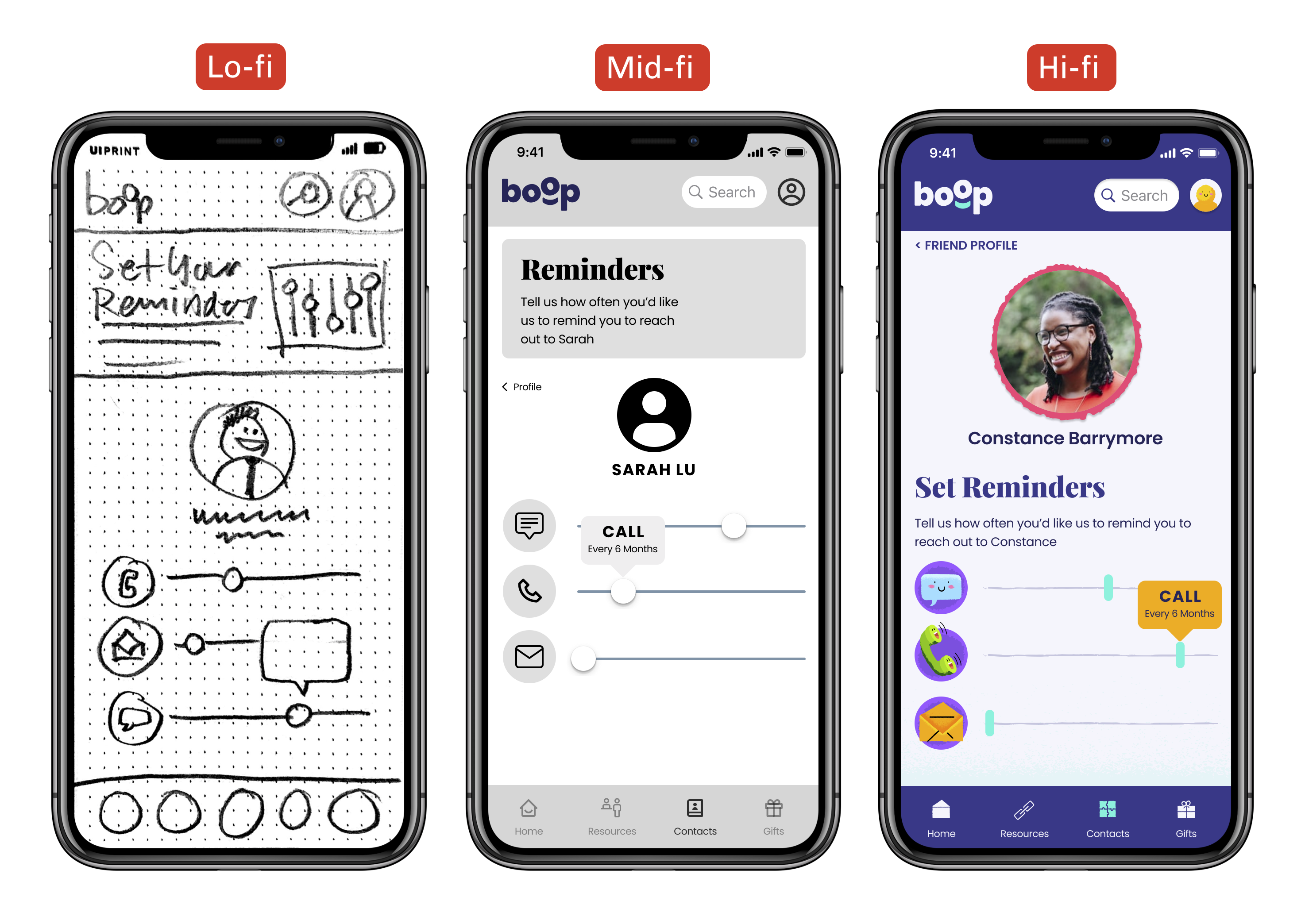
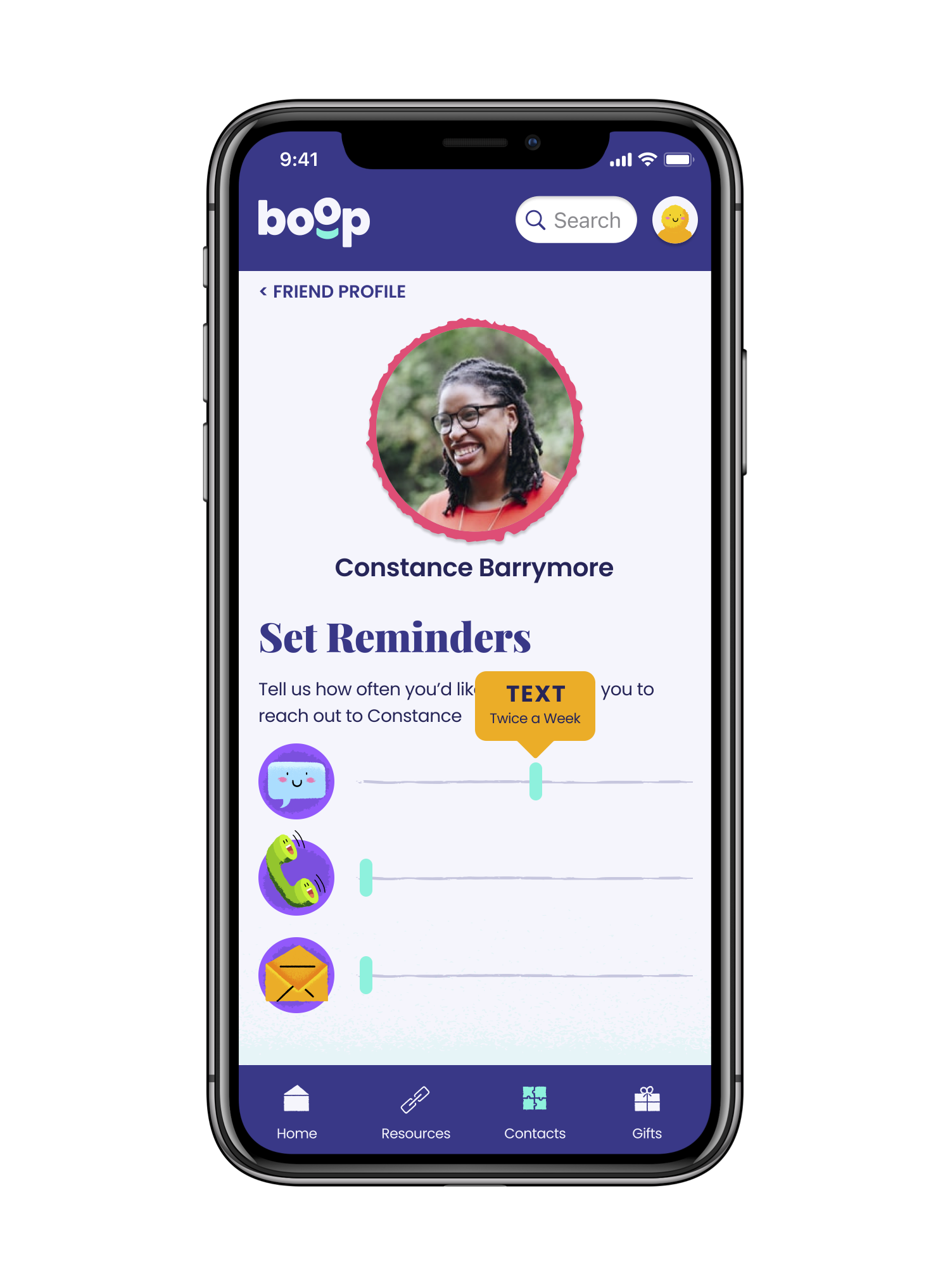
On the reminders screen, we utilized sliders to give the user control over their preferred communication types.
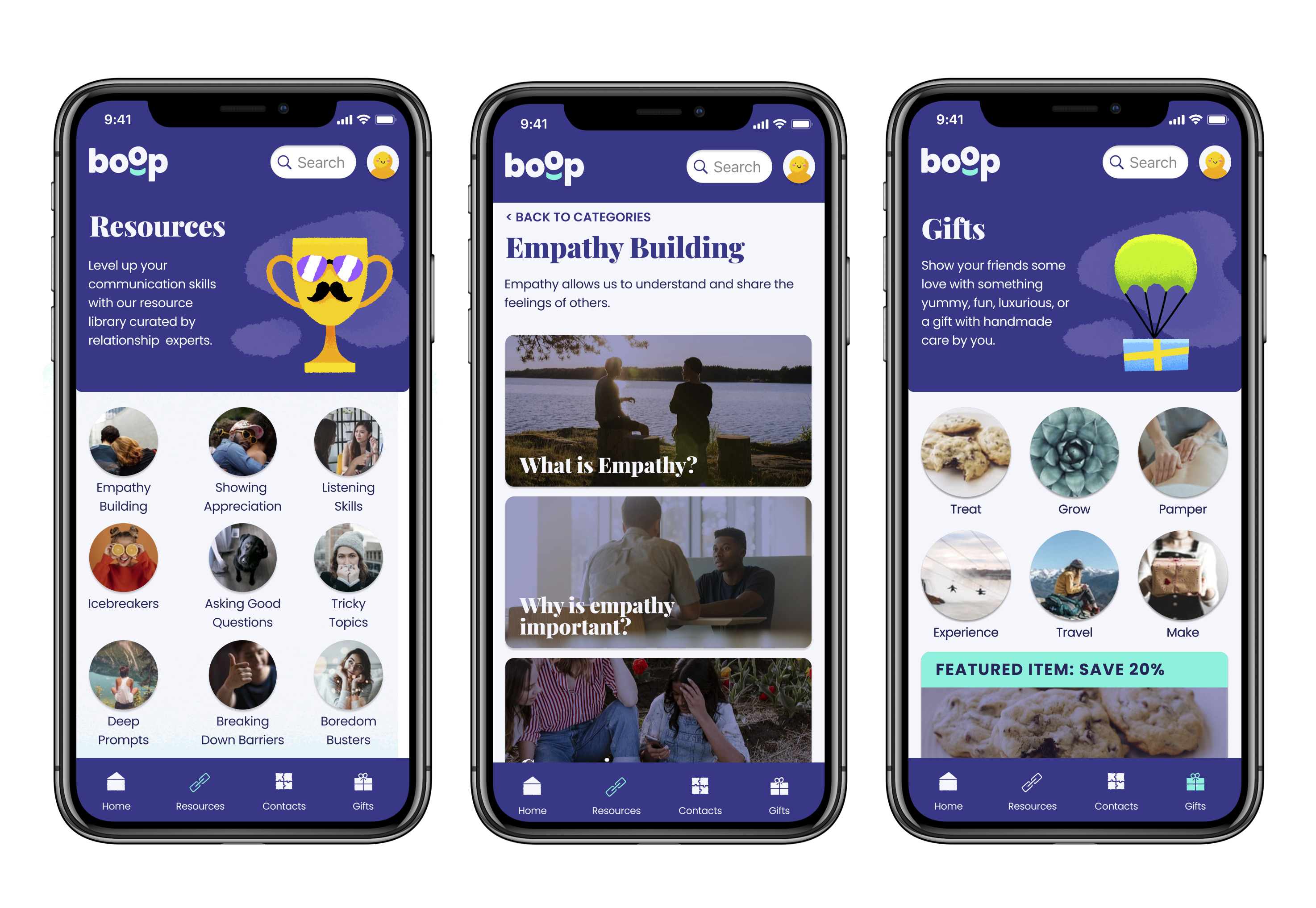
Resources provide valuable information to support positive communication within the app itself.
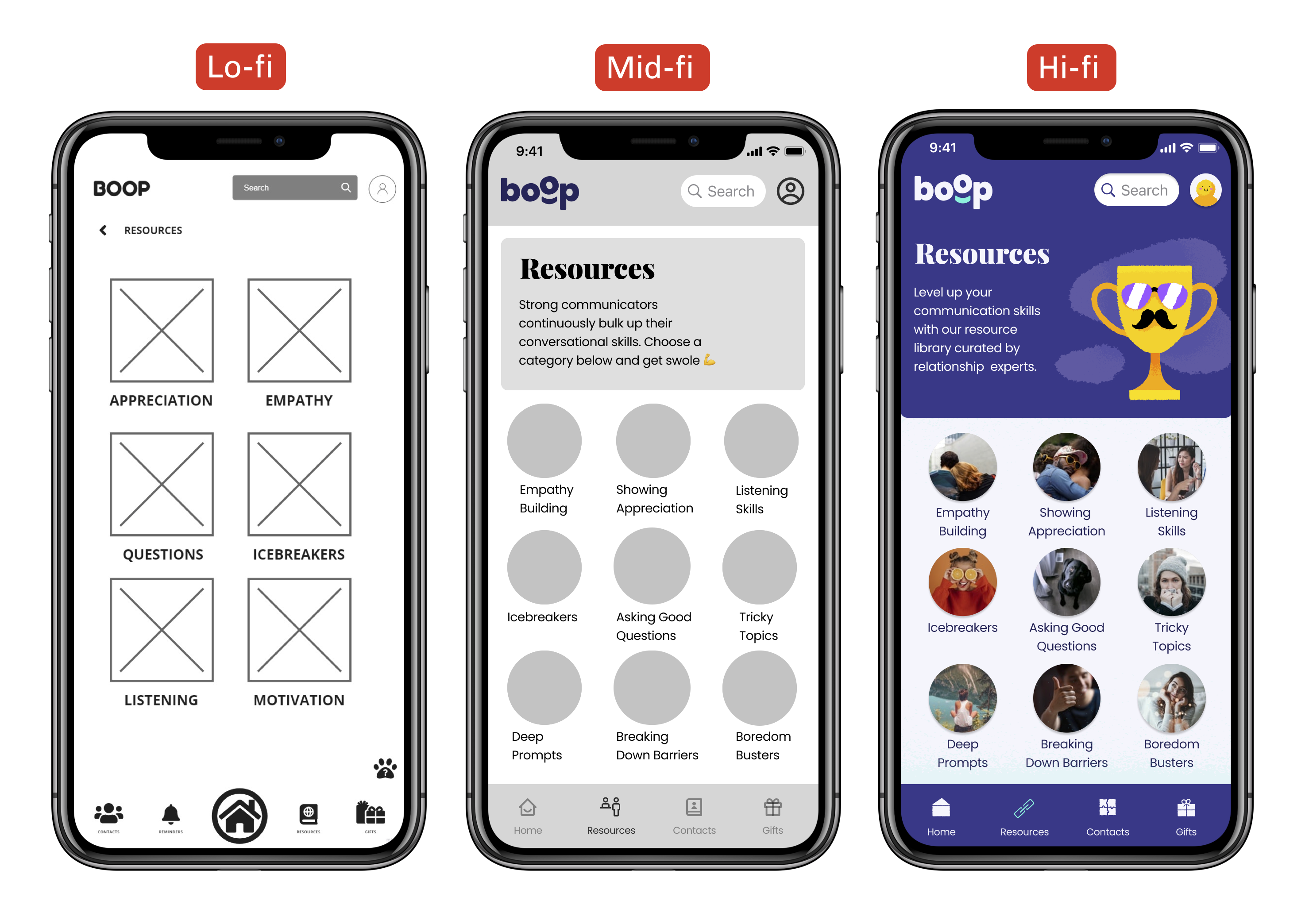
Resources provide valuable information to support positive communication within the app itself.

To come up with the app’s name, our team discussed how we wanted Becca’s friends to feel when she reached out to them. Whether she’s texting them a heartfelt hello or just sending a goofy meme, the goal of these touchpoints is to make the recipient feel good and like they are valued by Becca.
Our brainstorming eventually led us to reflect on the warm and fuzzy feelings we get from our four-legged best friends. As a team of dog lovers, we delighted in the uncomplicated joy they evoke and how how we often feel the urge to lovingly ‘boop’ (tap) them on the nose. We saw a playful tie between booping a dog on their nose and booping Becca to check in on a friend: We nudge her with a reminder notification and she sends out some joy to a friend.
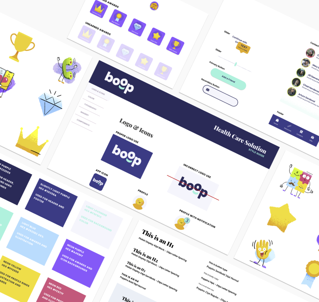
As a word, Boop reads as lighthearted, friendly, and approachable. Social isolation is a serious issue to be approached with warmth, sincerity, and tact. As such, Boop differentiates itself from typical healthcare apps and aligns more closely with social networks. From the unconventional name to the playful color palette and imagery, nothing about Boop feels medical or sterile.
(This handsome, grinning angel is my dog, Arlo. He’s got an immensely boop-able nose and truly does elicit the warm and fuzzy feelings we want all Boop users to find with their own friends. I couldn’t resist sharing a photo of one of the precious boops behind this product’s name.)

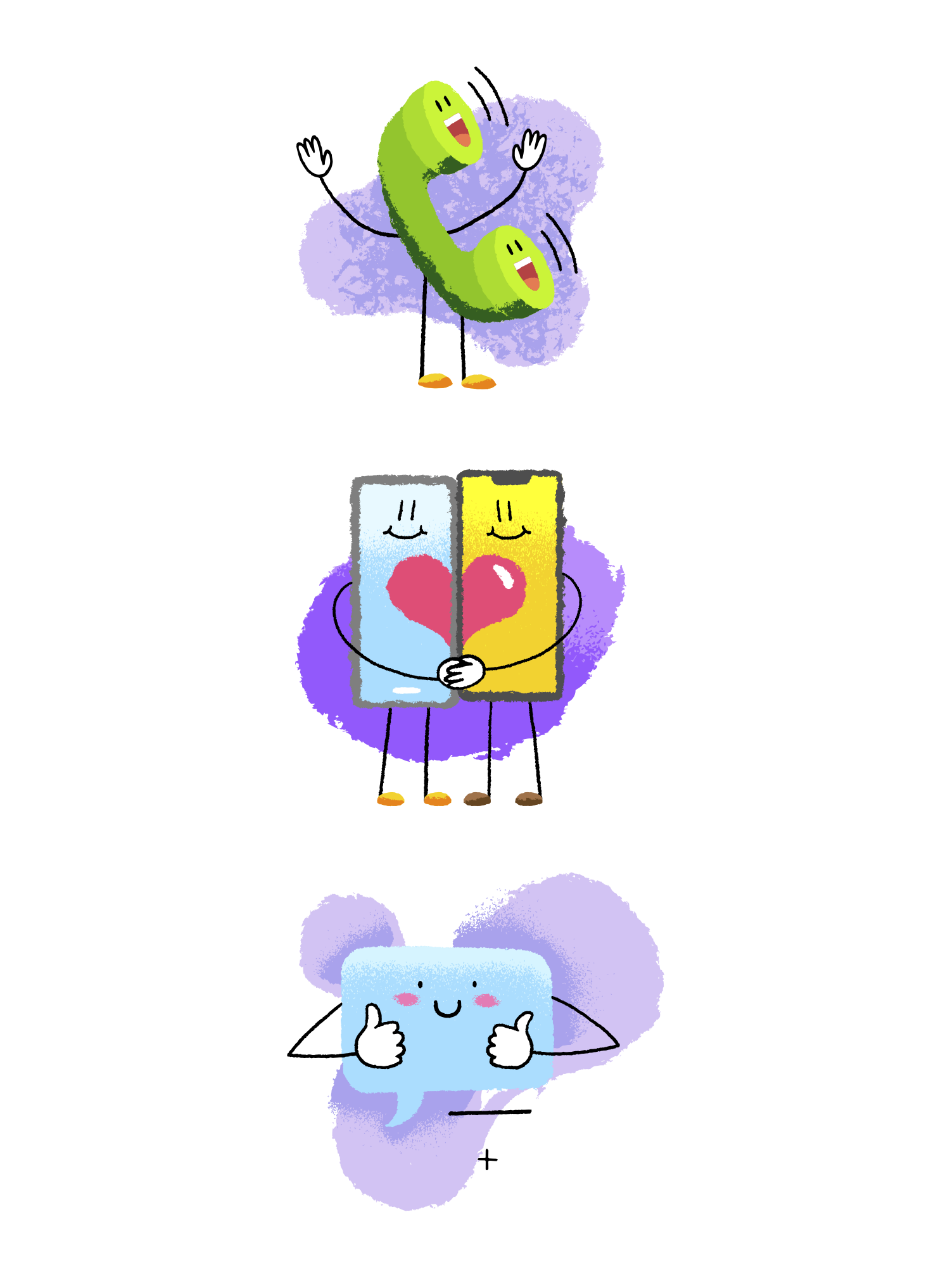
Our visual design approach focused on simplicity and a fun and friendly UI that would encourage regular use. We were able to source illustrations that worked well with our look and feel, and helped carry the friendly and inviting style throughout the experience. We wanted give the user control by giving the ability to add select contacts from their phone and set reminders to contact them using a simple, intuitive, and calendar free user interface. Becca has enough calendars to manage so we did not want to introduce another one into her busy life.
High Fidelity Prototypes
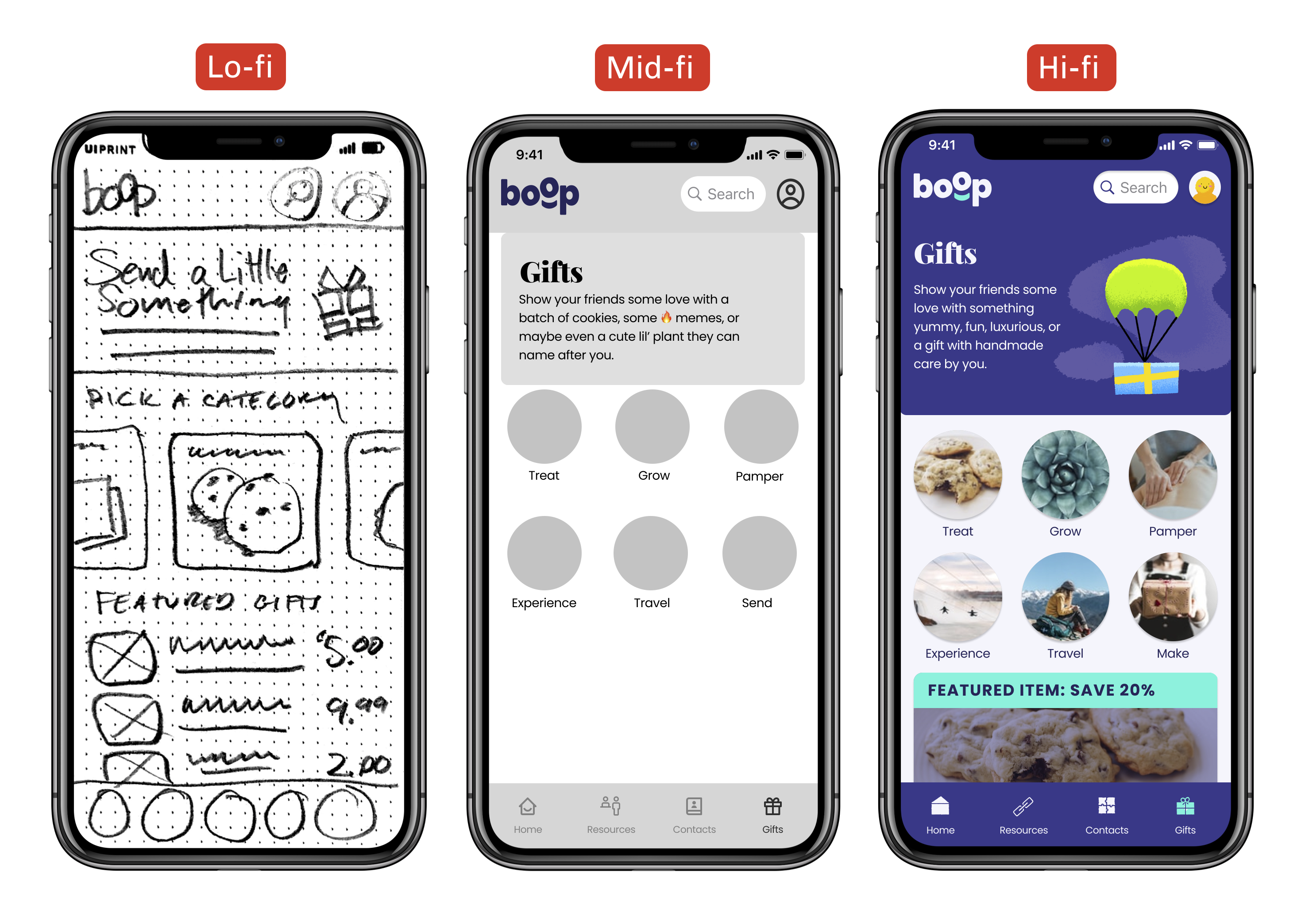
Because Becca is so busy, we included some relationship building resources that help her overcome various friendship blockers. The gift section will be the main revenue source for Boop and is the place that Becca can send thoughtful presents to her friends.
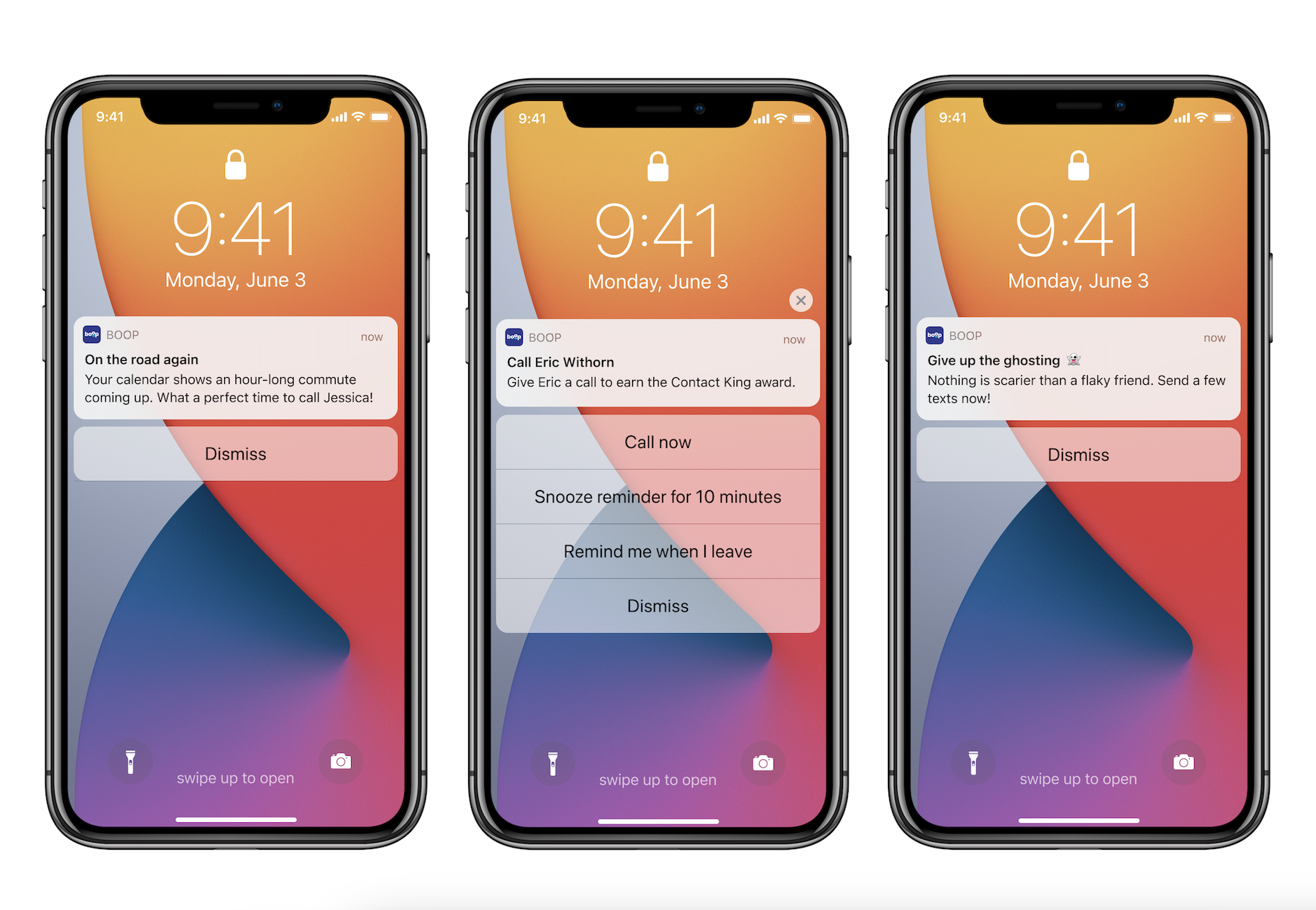
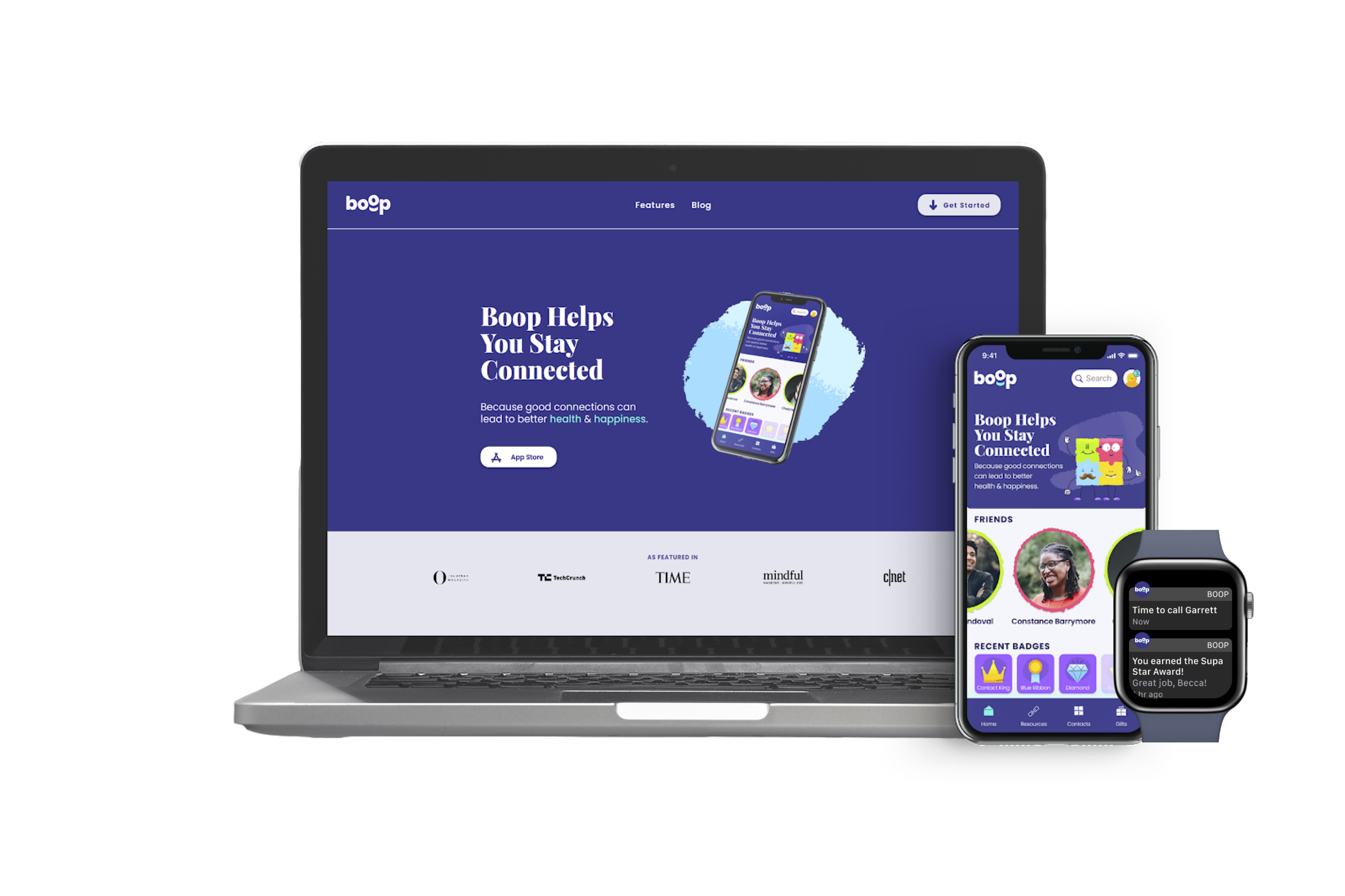
We designed dynamic notifications that encourage Becca to reach out to her friends based on opportunities in her schedule and the preferences she has set. Every time she contacts a designated contact, she levels up her status in the app which earns her rewards when she hits certain benchmarks.
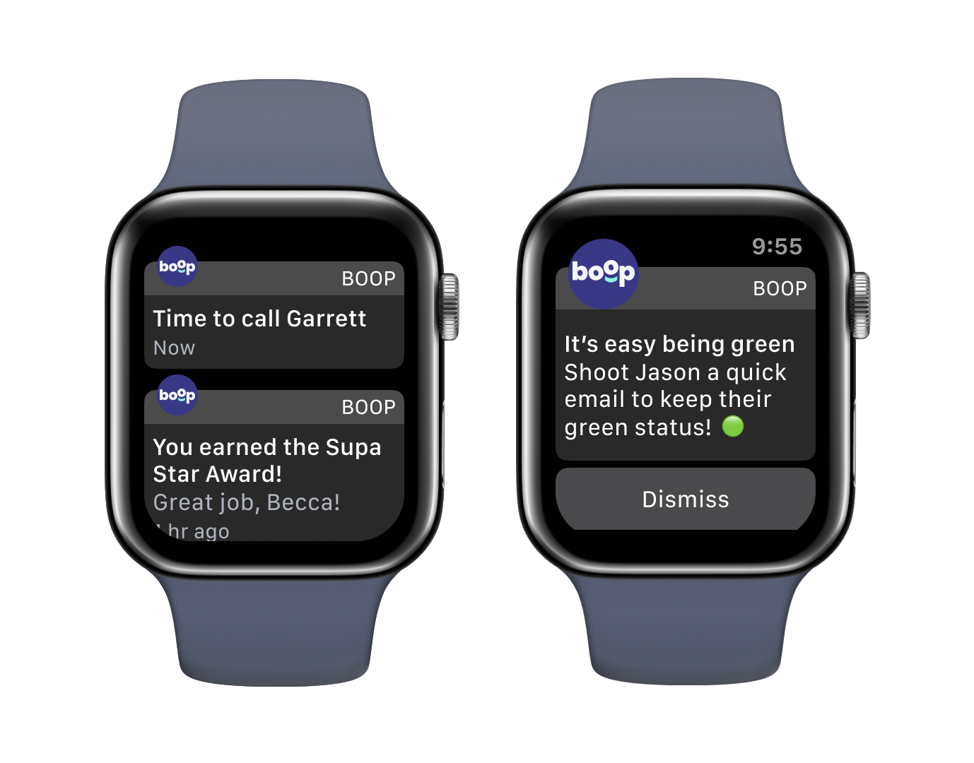
Our watch app mirrors these notifications, and reminds Becca when she hasn’t reached out recently.
Final thoughts
We reflected on our work and gathered the following insights to consider during future projects:
- Some decisions, like choosing to not implement a more exciting interface design, are tough but necessary when time is limited. Making that decision quickly and without getting too sentimental was critical to meeting our deadlines.
- There will always be debate about how much or how little you tell your user about your brand. Trust your gut and get the product out the door.
- A simple experience is a better experience. One key feature executed well is better than a lot of features no one really asked for.
- An intuitive UI beats a lengthy onboarding process any day.
If this product were to actually launch, we would want to consider the following for our next steps:
- Develop for the Android market.
- Seek out a mental health organization whose mission is complementary to ours to form a partnership. The goal of this partnership would be to reinforce our legitimacy as a mental health aid.
- Continue to develop and test the reward badges to determine if gamification helps our user meet their goals without detracting from the experience.
- Shop the app to potential gifting partners to begin to understand its value from a monetization standpoint.


Contact

